Uber

Redesigning Uber's US W9 tax flow to turn a compliance crisis into a guided, scalable experience

Redesigning Uber's US W9 tax flow to turn a compliance crisis into a guided, scalable experience

Due to my NDA, I can't share actual imagery, data, or volumes from this project. What you see here is recreated for illustration — the strategy, design thinking, and decision-making logic stay true to the original work.

Due to my NDA, I can't share actual imagery, data, or volumes from this project. What you see here is recreated for illustration — the strategy, design thinking, and decision-making logic stay true to the original work.

Due to my NDA, I can't share actual imagery, data, or volumes from this project. What you see here is recreated for illustration — the strategy, design thinking, and decision-making logic stay true to the original work.

Results

Users impacted

5M+

U.S. earners covered by a redesigned tax form

Documents generated

2M+

Tax forms generated

Compliance

5.6% -> 23%

Completion moved from 5.6% toward a compliant threshold

Team

Product Design

woman in black shirt smiling
a man with black hair and a beard smiling
man in black crew neck shirt wearing black framed eyeglasses

Product Management & Engineering

Tech stack

woman in black shirt smiling
a man with black hair and a beard smiling
man in black crew neck shirt wearing black framed eyeglasses

Design & AI

Role

Led end-to-end design and was embedded with the research team from the first redesigned iteration through public launch. Owned the product experience in full — auto-fill logic, inline validation, and the review flow — working directly with compliance and engineering along the way.

Overview

Only 5.6% profiles submitted, even though Uber already had their data

Only 5.6% profiles submitted, even though Uber already had their data

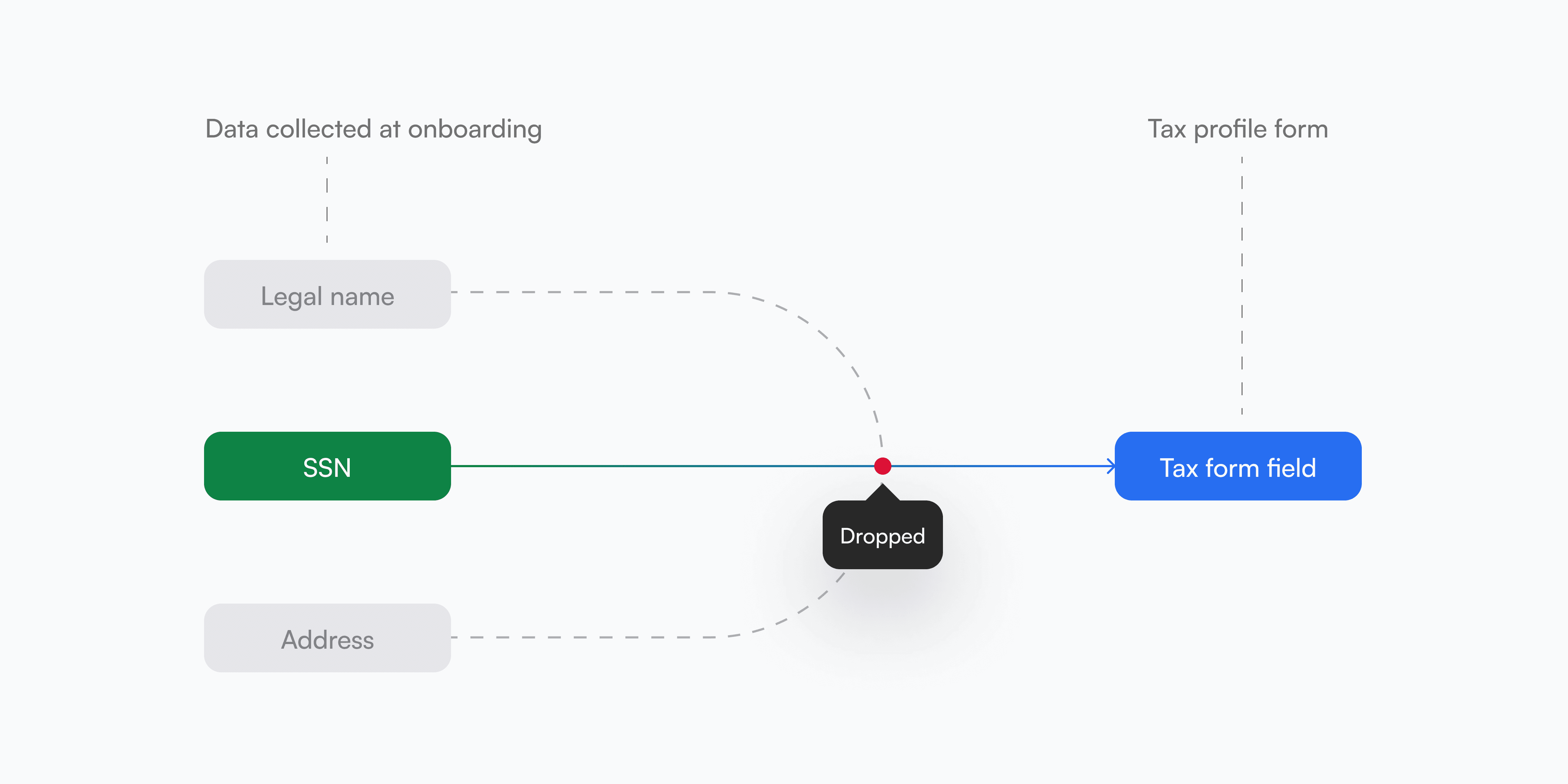
Tax profile completion sat at 5.6% among U.S. drivers and couriers, despite being mandatory for IRS 1099 reporting. Uber already had the data it needed — legal name, SSN, address — but only SSN carried into the form, and validation ran offline after submission with no way to catch a mismatch before it became a support ticket or a $180 penalty Uber had already absorbed once. I redesigned the flow to auto-fill known data, validate inline, and prompt review proactively — turning a legal obligation nobody understood into a guided path earners could complete correctly in one sitting.

Insights

One platform. 3 user worlds

Funds, portfolio companies, and corporates each had fundamentally different goals. The experience had to adapt to all three without fracturing into three separate products.

Investors wanted the hard numbers

Surface-level summaries weren’t enough. Real-time financials and cap table data needed to be embedded directly in profiles.

Pitch fatigue was real

Investors were overwhelmed by irrelevant deals, demanding high-precision filtering by niche, stage, and sector.

Trust over trendiness

In high-stakes finance, the interface had to feel authoritative, transparent, and credible — not just visually appealing.

Explorations & iterations

3 concepts = 1 clear winner

3 concepts = 1 clear winner

Before committing to a direction, I explored three distinct concepts — stress-testing the balance between legal compliance and user speed through structured A/B/C testing with real earners.

Testing led me into asking myself this quesion

Testing led me into asking myself this quesion

How might we turn a legal obligation nobody understood into a guided path earners complete correctly the first time?

How might we turn a legal obligation nobody understood into a guided path earners complete correctly the first time?

Which led to these deliverables

Which led to these deliverables

Work

4 user frustrations, fixed with 1 simple form

4 user frustrations, fixed with 1 simple form

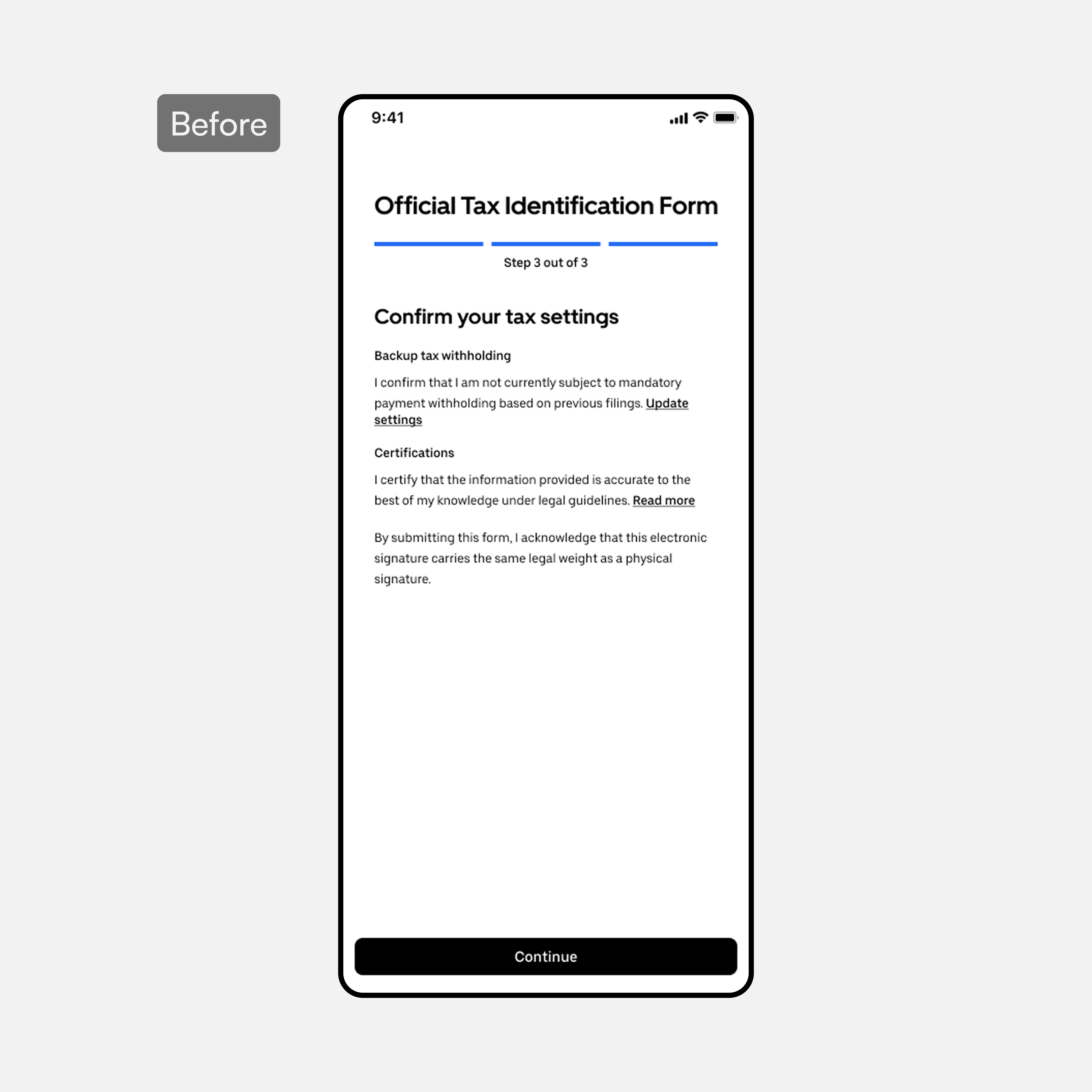
BeforeAfter
Intro
Intro

Intro

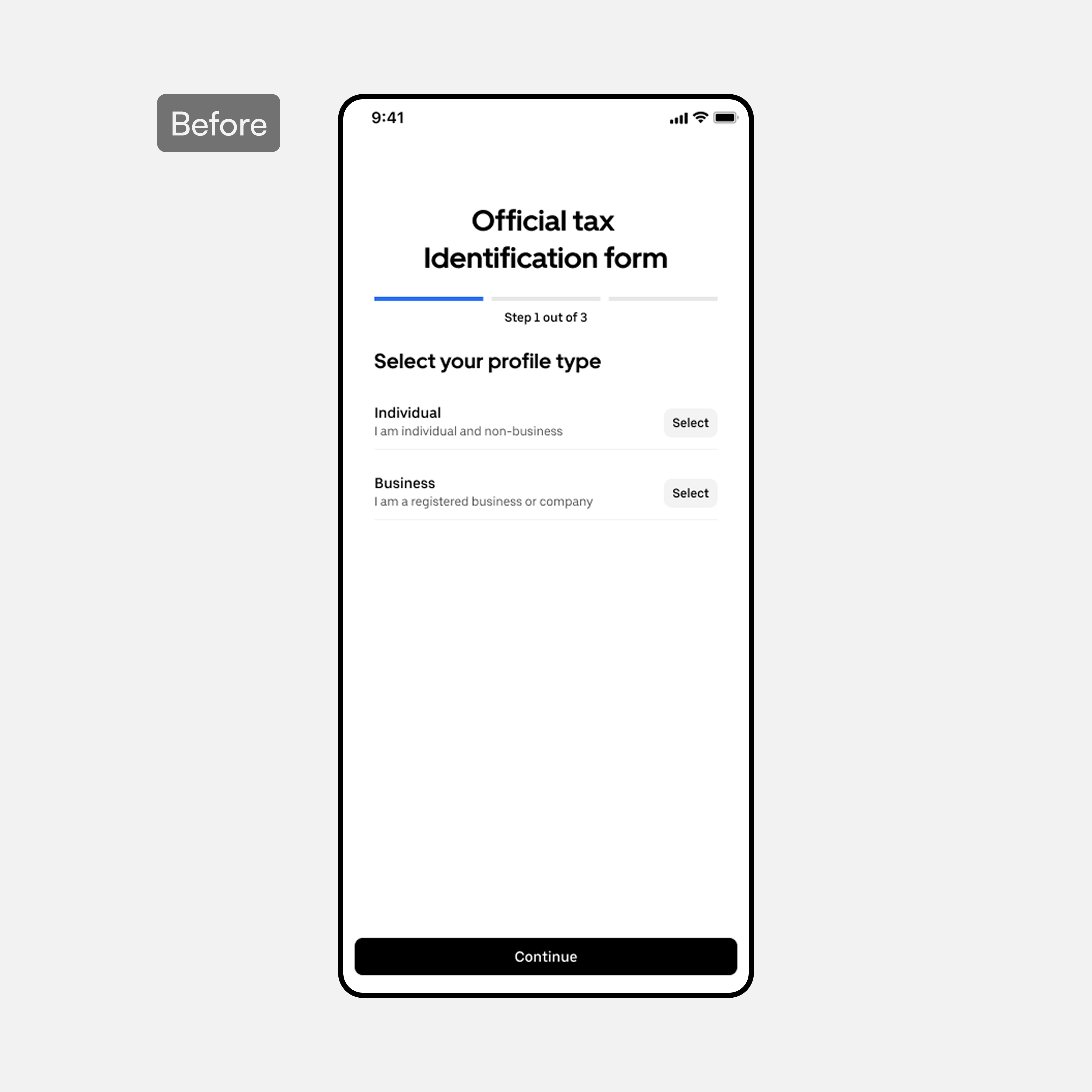
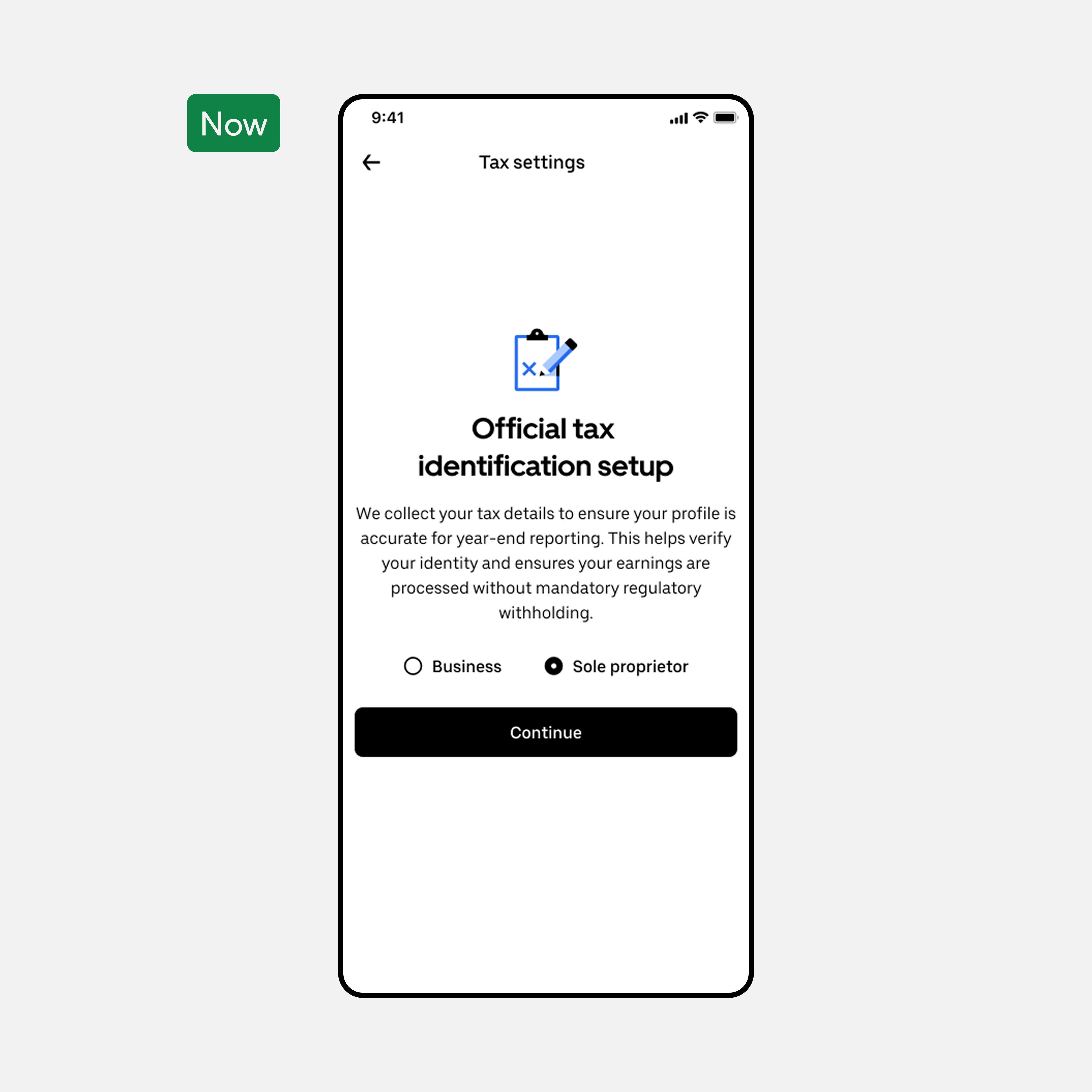
  • Added context and purpose upfront — earners knew exactly what they were completing and why before touching a single field

  • Entity preference selection at the start ensured the flow branched correctly, preventing mid-flow confusion

  • A clear CTA replaced an ambiguous entry point, directly reducing first-step drop-off

  • Added context and purpose upfront — earners knew exactly what they were completing and why before touching a single field

  • Entity preference selection at the start ensured the flow branched correctly, preventing mid-flow confusion

  • A clear CTA replaced an ambiguous entry point, directly reducing first-step drop-off

  • Added context and purpose upfront — earners knew exactly what they were completing and why before touching a single field

  • Entity preference selection at the start ensured the flow branched correctly, preventing mid-flow confusion

  • A clear CTA replaced an ambiguous entry point, directly reducing first-step drop-off

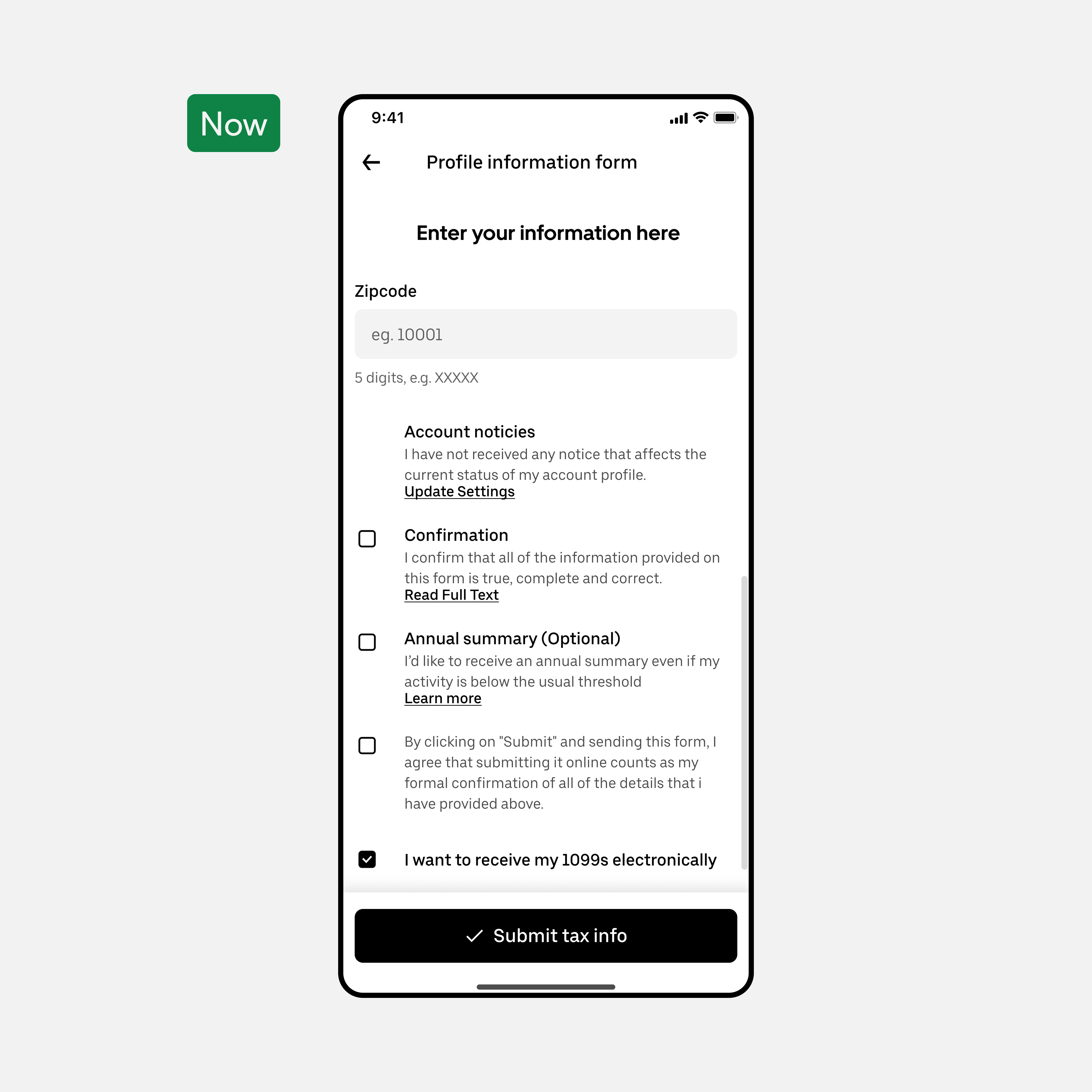
BeforeAfter
Data form
Data form

Data form

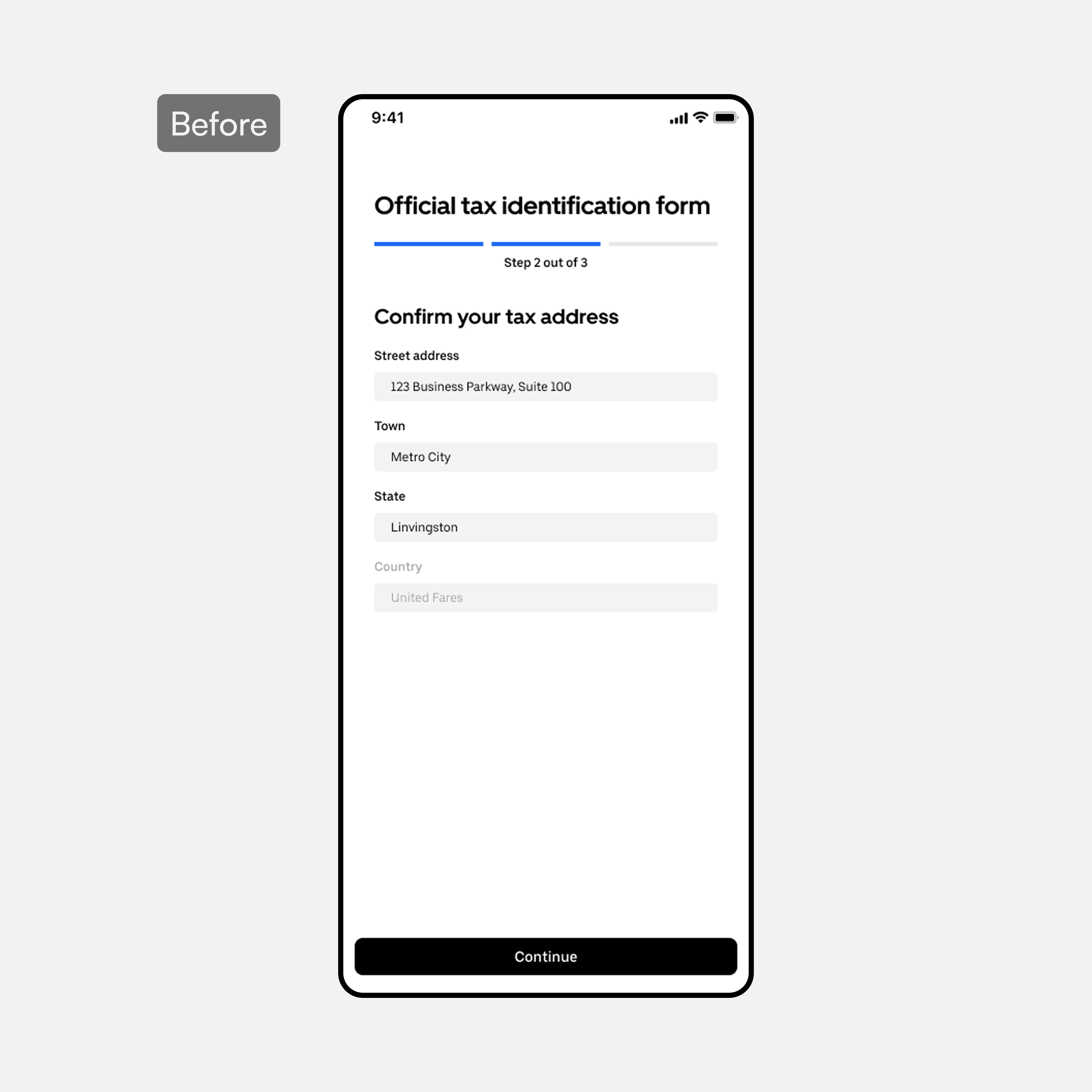
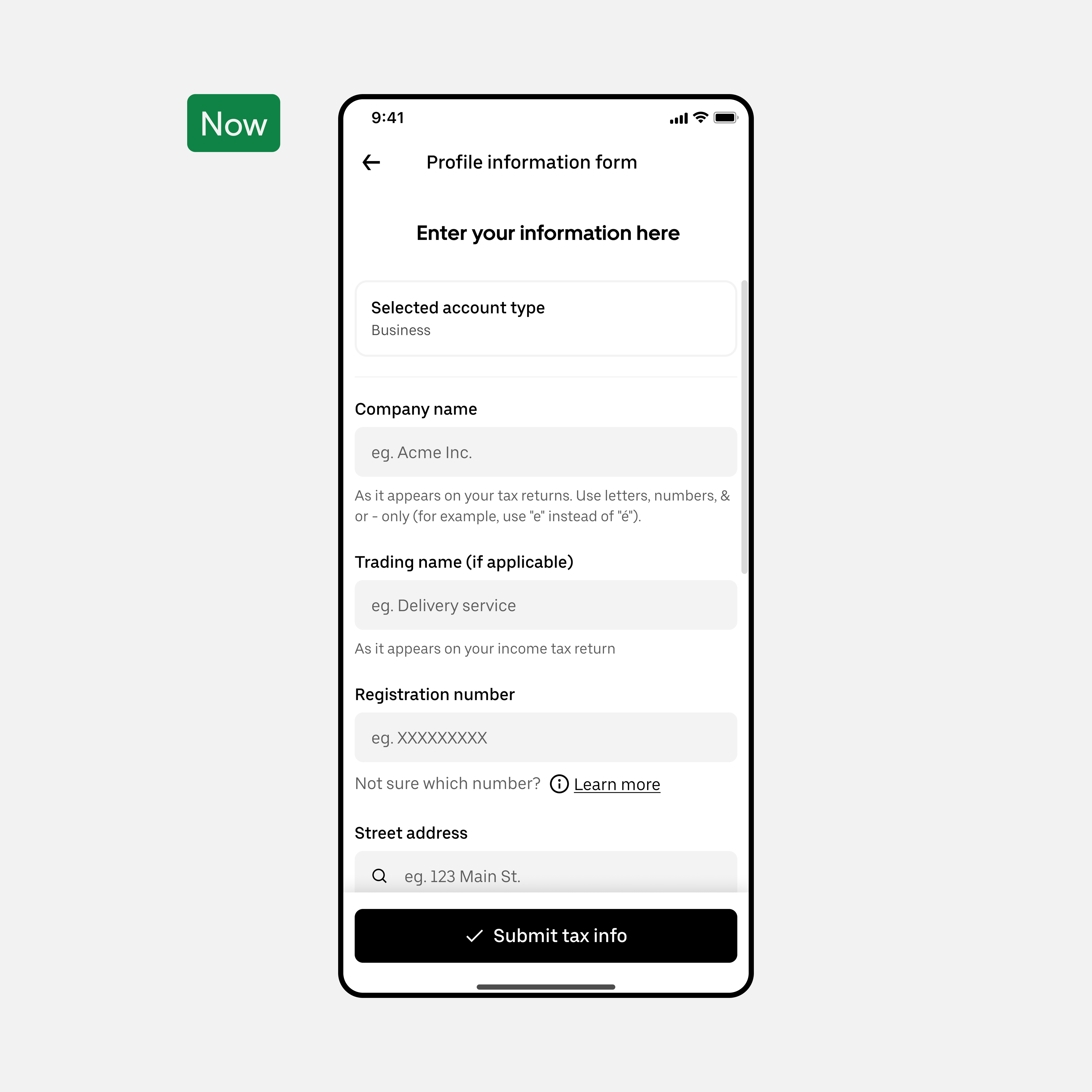
  • Collapsed three disconnected steps into one linear scrollable form, eliminating disorientation between screens

  • Confirmation banners and success messages replaced silence — earners knew their input was accepted

  • Related fields grouped logically, reducing errors from unrelated data sitting side by side

  • Collapsed three disconnected steps into one linear scrollable form, eliminating disorientation between screens

  • Confirmation banners and success messages replaced silence — earners knew their input was accepted

  • Related fields grouped logically, reducing errors from unrelated data sitting side by side

  • Collapsed three disconnected steps into one linear scrollable form, eliminating disorientation between screens

  • Confirmation banners and success messages replaced silence — earners knew their input was accepted

  • Related fields grouped logically, reducing errors from unrelated data sitting side by side

BeforeAfter
Certifications

Certifications

  • Brought certifications to the first navigation level — no more opening dialogs just to see what needed to be done

  • Dialogs reserved for additional context only, cutting unnecessary interaction steps

  • Shorter path, same compliance outcome — earners completed certifications faster with less friction

  • Brought certifications to the first navigation level — no more opening dialogs just to see what needed to be done

  • Dialogs reserved for additional context only, cutting unnecessary interaction steps

  • Shorter path, same compliance outcome — earners completed certifications faster with less friction

  • Brought certifications to the first navigation level — no more opening dialogs just to see what needed to be done

  • Dialogs reserved for additional context only, cutting unnecessary interaction steps

  • Shorter path, same compliance outcome — earners completed certifications faster with less friction

New "view mode"
New "view mode"

New "view mode"

  • Read-only state — earners could review their full profile without risk of accidental edits

  • Completeness indicator replaced total invisibility — compliance status was now immediately clear

  • Full data review turned a blind confirmation into a confident final check

  • Read-only state — earners could review their full profile without risk of accidental edits

  • Completeness indicator replaced total invisibility — compliance status was now immediately clear

  • Full data review turned a blind confirmation into a confident final check

  • Read-only state — earners could review their full profile without risk of accidental edits

  • Completeness indicator replaced total invisibility — compliance status was now immediately clear

  • Full data review turned a blind confirmation into a confident final check

AI demo

Vibe coded prototype

Vibe coded prototype

I used AI-assisted tooling to prototype the actual interactions — auto-fill, inline validation, and the review flow — so you can click through it instead of judging it from static screens alone. It's a prototype, not production code, but the logic mirrors the real design decisions.