Transact Digital

Built a 01 AI matchmaking platform for startups and investors and secured $2M in national funding to scale it

Built a 01 AI matchmaking platform for startups and investors and secured $2M in national funding to scale it

Results

Businesses impacted

100+

Private funds onboarded within 6 months of launch

Research funding

$2M

In national funding secured — validating the platform's potential to scale

Overview

No market precedent. 3 completely different user worlds = 1 platform.

No market precedent. 3 completely different user worlds = 1 platform.

There was no blueprint, no dominant competitor, and no established playbook for what a startup-investor matchmaking platform should look, feel, or behave like. As the founding product designer, I built it from scratch. The platform had to serve three fundamentally different user types — investment funds, portfolio companies, and corporates — each with different goals and different needs. Most matchmaking still happened through personal networks, cold emails, and spreadsheets, so every decision had to be justified from first principles. Getting it wrong would mean building something nobody actually used.

Insights

One concept. Real users. Honest feedback.

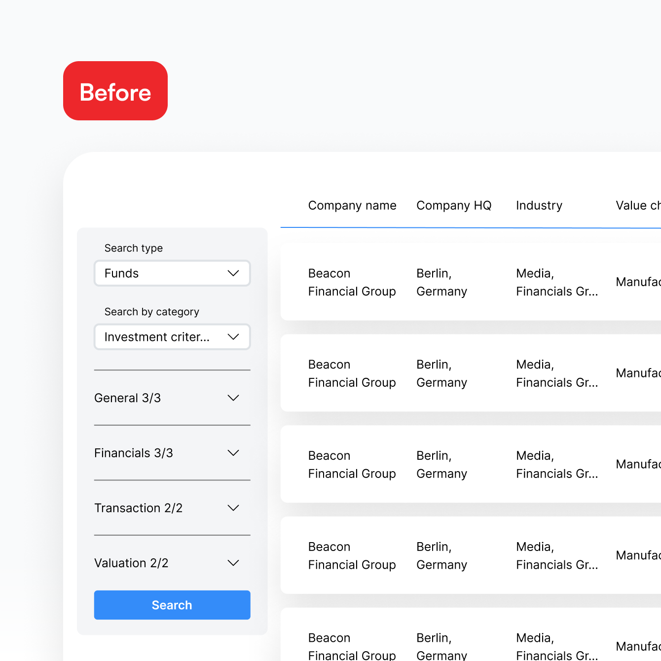
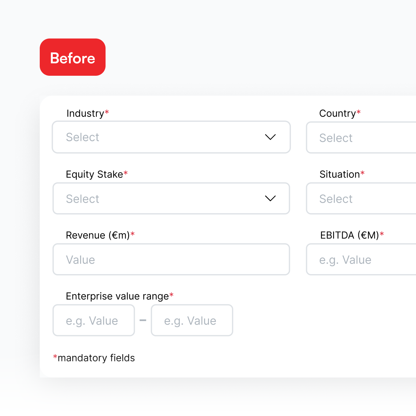
I ran five 1:1 usability sessions and a focus group with a mid-fidelity prototype. The data-heavy direction landed well. The navigation didn't. Users knew what they wanted — they just couldn't find it fast enough. The feedback was direct:

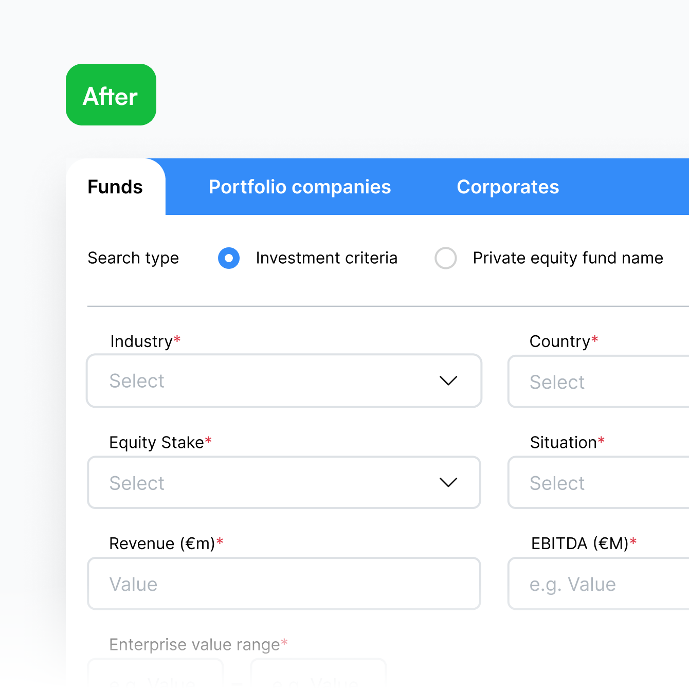
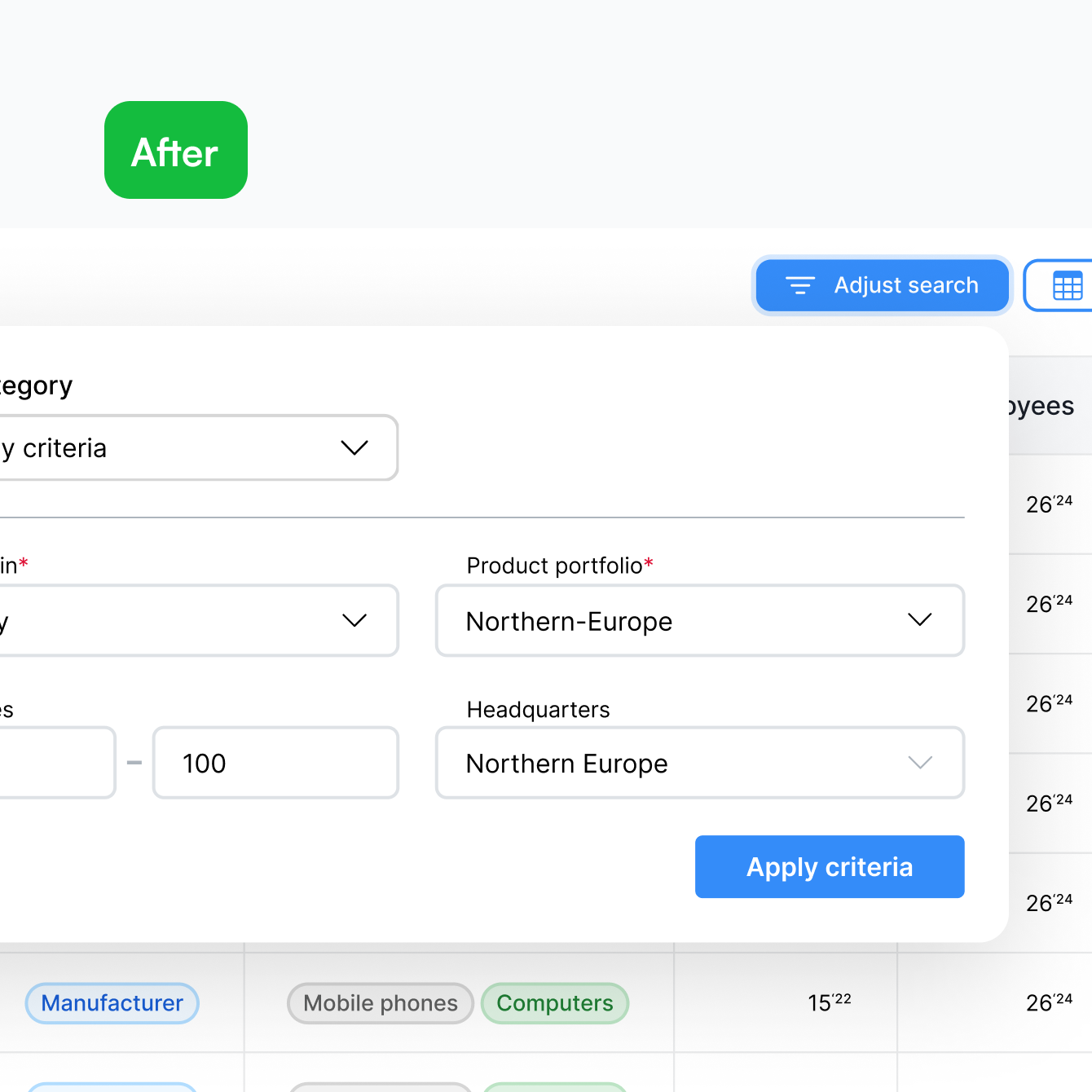
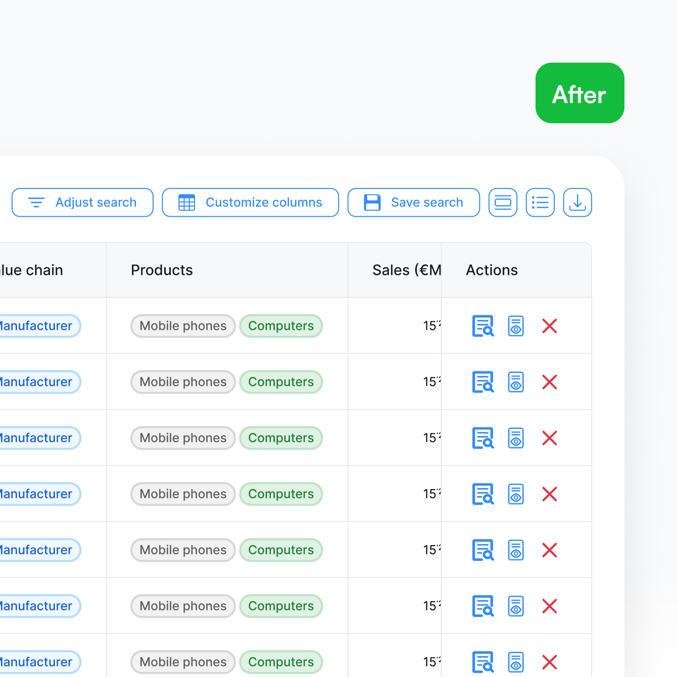
BeforeAfter
BeforeAfter

One platform. 3 user worlds

One platform. 3 user worlds

Funds, portfolio companies, and corporates each had fundamentally different goals. The experience had to adapt to all three without fracturing into three separate products.

Investors wanted the hard numbers

Investors wanted the hard numbers

Surface-level summaries weren’t enough. Real-time financials and cap table data needed to be embedded directly in profiles.

Pitch fatigue was real

Pitch fatigue was real

Investors were overwhelmed by irrelevant deals, demanding high-precision filtering by niche, stage, and sector.

Trust over trendiness

Trust over trendiness

In high-stakes finance, the interface had to feel authoritative, transparent, and credible — not just visually appealing.

Build the right thing

How might we create a "common language" between ambitious founders and analytical fund managers to ensure the right opportunities aren't lost in the noise?

How might we create a "common language" between ambitious founders and analytical fund managers to ensure the right opportunities aren't lost in the noise?

Work

3 systems. Built to solve what research exposed.

Search that filters by stage, sector, and funding type from the very first interaction

  • Filters by industry stage, funding type, and sector from the first interaction

  • Precision targeting that eliminates irrelevant deal flow immediately

  • Designed directly from the "fishing in the ocean" feedback

Granular access control

Centralized dashboard for managing subscriptions and user roles
• Precise control over access and permission levels
Role-based visibility for every team member

Turning a typed sentence into a structured search query

  • An agentic AI layer converts natural language inputs into structured search criteria

  • Removes the need for manual filter-building across complex parameters

  • Results saved directly into organised project folders for team collaboration

Key deliverables

01

Full scale responsive platform

Works identically across desktop, tablet, and mobile — no fallback layouts, no broken states.

03

Systematic component library

Built and scaled as the platform's single source of truth — keeping design consistent and shipping faster.

Retrospective

What building from zero taught me

What building from zero taught me

First principles beat best practices.

There was no competitor to benchmark against. Every decision had to be justified by user need and business logic alone. That constraint made the work sharper — and taught me to question assumptions I'd normally take for granted.

There was no competitor to benchmark against. Every decision had to be justified by user need and business logic alone. That constraint made the work sharper — and taught me to question assumptions I'd normally take for granted.

The product is never the hard part.

Getting three fundamentally different user types — funds, founders, corporates — to trust the same platform required as much communication and stakeholder alignment as it did design execution. The hardest problem wasn't the interface. It was the shared mental model.

Getting three fundamentally different user types — funds, founders, corporates — to trust the same platform required as much communication and stakeholder alignment as it did design execution. The hardest problem wasn't the interface. It was the shared mental model.

Validation changes everything.

The $2M funding outcome wasn't just a business result — it was confirmation that the design decisions translated into real-world confidence. Investors don't fund products they don't trust. That was the most direct feedback I've ever received on design quality.

The $2M funding outcome wasn't just a business result — it was confirmation that the design decisions translated into real-world confidence. Investors don't fund products they don't trust. That was the most direct feedback I've ever received on design quality.

One concept. Real users. Honest feedback.

I ran five 1:1 usability sessions and a focus group with a mid-fidelity prototype. The data-heavy direction landed well. The navigation didn't. Users knew what they wanted — they just couldn't find it fast enough. The feedback was direct:

BeforeAfter
BeforeAfter

One platform. 3 user worlds

Funds, portfolio companies, and corporates each had fundamentally different goals. The experience had to adapt to all three without fracturing into three separate products.

Investors wanted the hard numbers

Surface-level summaries weren’t enough. Real-time financials and cap table data needed to be embedded directly in profiles.

Pitch fatigue was real

Investors were overwhelmed by irrelevant deals, demanding high-precision filtering by niche, stage, and sector.

Trust over trendiness

In high-stakes finance, the interface had to feel authoritative, transparent, and credible — not just visually appealing.