Uber

Redesigning Uber's Mexico tax flow to turn a 70% drop-off into a clear reason to finish

Redesigning Uber's Mexico tax flow to turn a 70% drop-off into a clear reason to finish

Due to my NDA, I can't share actual imagery, data, or volumes from this project. What you see here is recreated for illustration — the strategy, design thinking, and decision-making logic stay true to the original work.

Due to my NDA, I can't share actual imagery, data, or volumes from this project. What you see here is recreated for illustration — the strategy, design thinking, and decision-making logic stay true to the original work.

Results

User profiles

+31%

Same-week tax profile submissions within 3 weeks of launch

Direct impact

-33%

Drop in tax ID mismatch failures

Submissions

86% → 93%

Cross-check eligible submissions up 7pp

Team

Product Design

woman in black shirt smiling
a man with black hair and a beard smiling
man in black crew neck shirt wearing black framed eyeglasses

Product Management & Engineering

Tech stack

woman in black shirt smiling
a man with black hair and a beard smiling
man in black crew neck shirt wearing black framed eyeglasses

Design & AI

Role

Led end-to-end design and partnered with the research and data teams from initial concept through launch. Beyond the shipped experience, I scoped and proposed the next-phase opportunity — moving tax verification post-onboarding — sizing the projected upside and risk trade-offs for the business case.

Overview

70% profiles dropped off — because nobody explained why it mattered

70% profiles dropped off — because nobody explained why it mattered

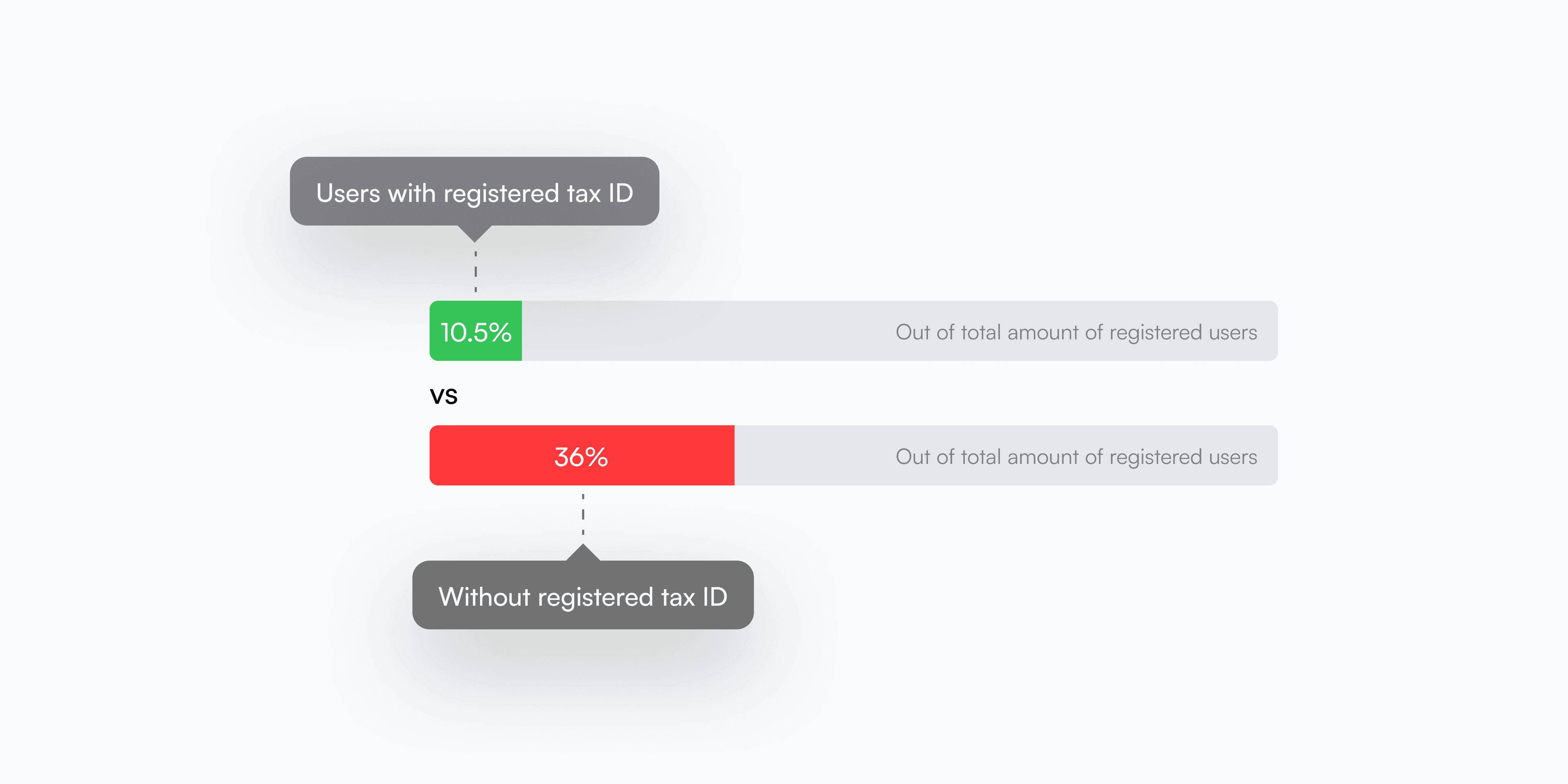
The tax form was the most confusing step in Mexico's onboarding funnel — up to 70% of high-intent earners dropped off in Delivery, 58% in Mobility. Earners routinely entered the wrong legal name, tax regime, and postal code, with no explanation of why these fields mattered. I approached completion as a motivation problem, not just a usability one: earners now see the real financial trade-off upfront — 10.5% tax withholding with a registered tax ID versus 36% without — backed by smarter defaults, a direct pathway to register a tax ID, and contextual guidance matched to each earner type.

Insights

Upfront didn't mean compliant

Requiring tax verification before access didn't guarantee the compliance it was built for — in one major market, only a minority of drivers were compliant despite it.

1 bottleneck, 2 verticals

In Delivery, tax info gated both going online and triggering the background check — a single stall point blocking two paths to activation at once.

Fraud checks blocked before earning began

Validation logic catching tax ID and name mismatches sat inside the onboarding funnel itself, blocking access before a driver had earned anything.

The form didn't know who it was talking to

Labels didn't distinguish individual filers from business ones, and unrelated fields were grouped as if connected — small confusions stacked on top of a hard gate.
Testing led me into asking myself this quesion

Testing led me into asking myself this quesion

How might we let earners start earning without weakening the fraud checks built to protect the platform?

How might we let earners start earning without weakening the fraud checks built to protect the platform?

Which led to these deliverables

Which led to these deliverables

Work

A form that finally made sense.

A form that finally made sense.

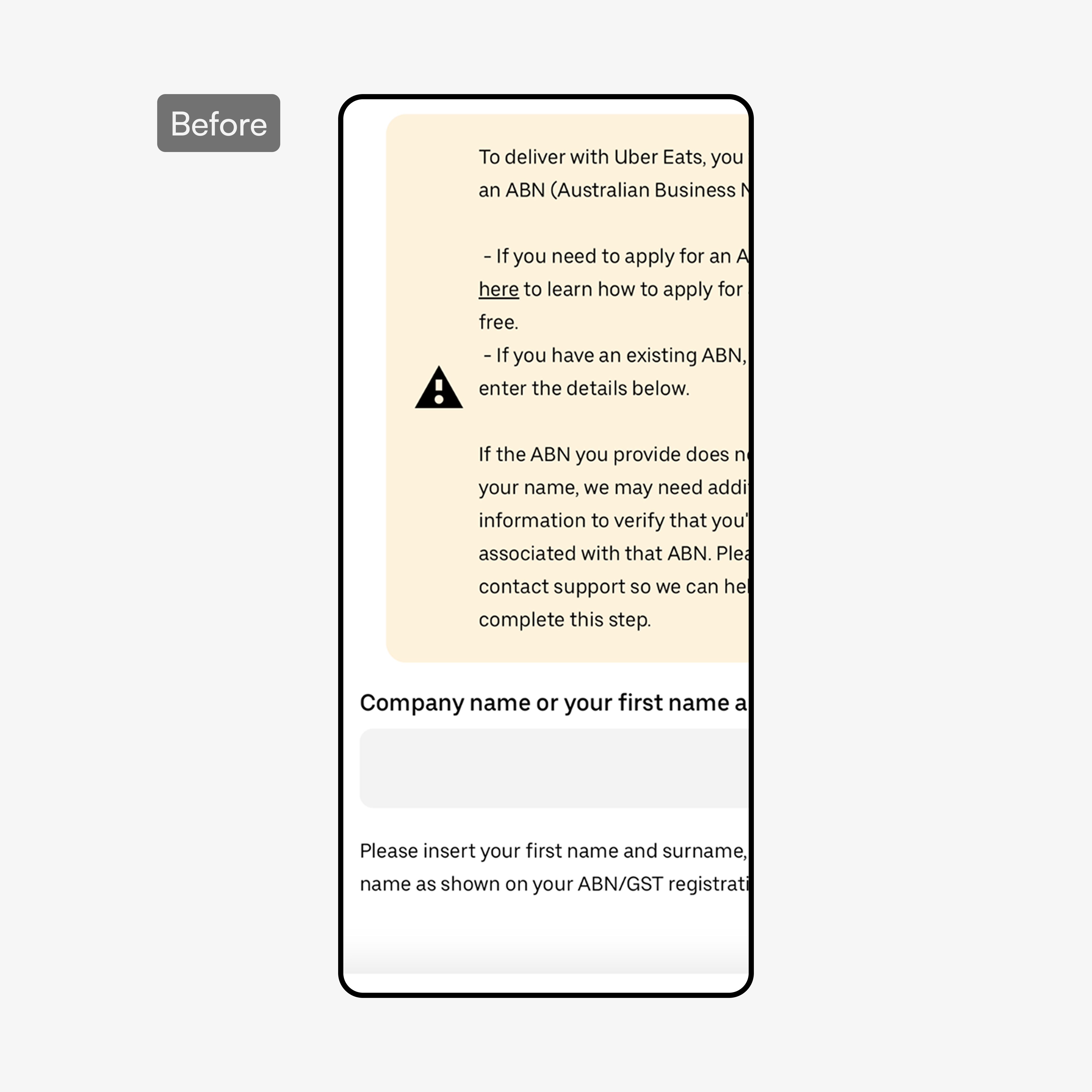
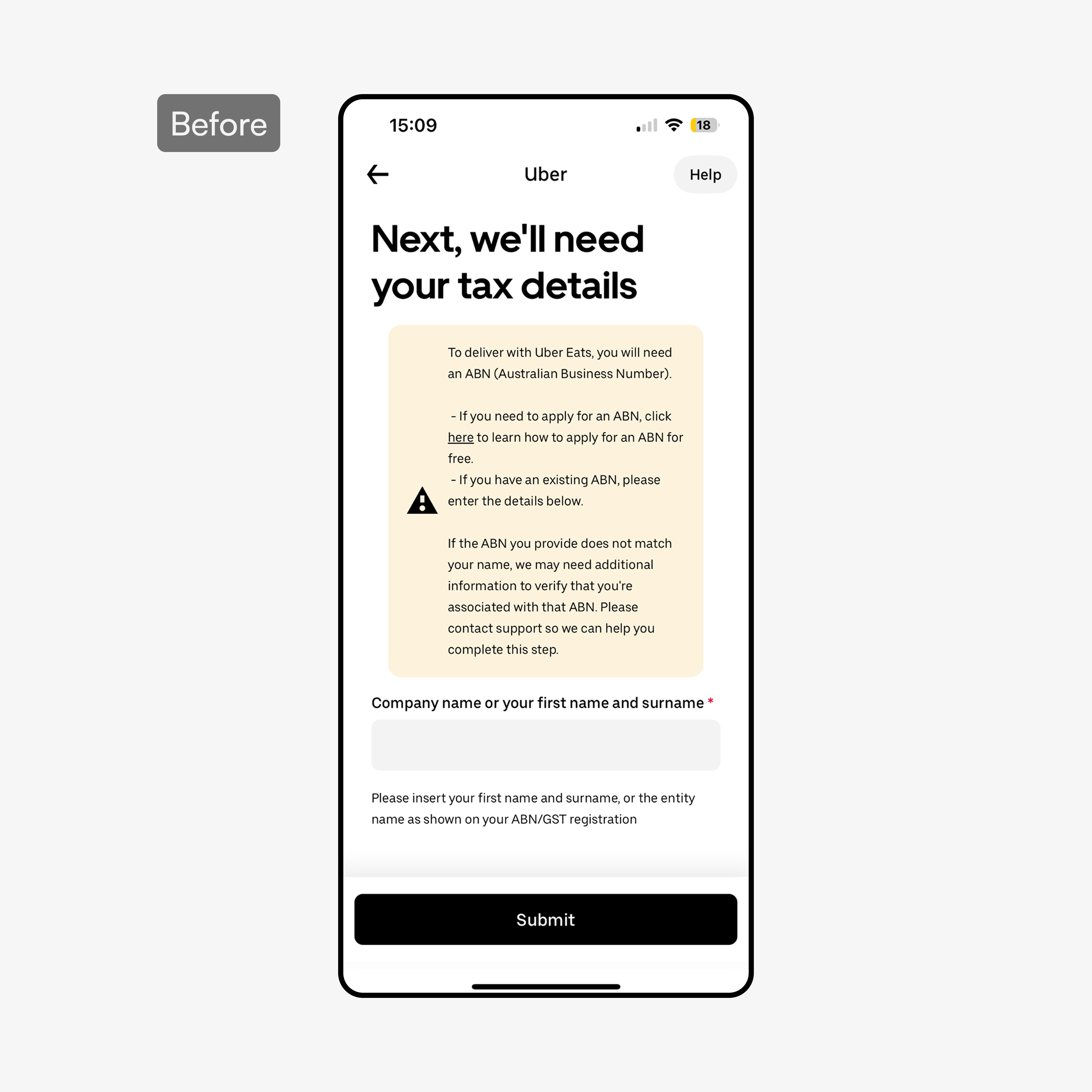
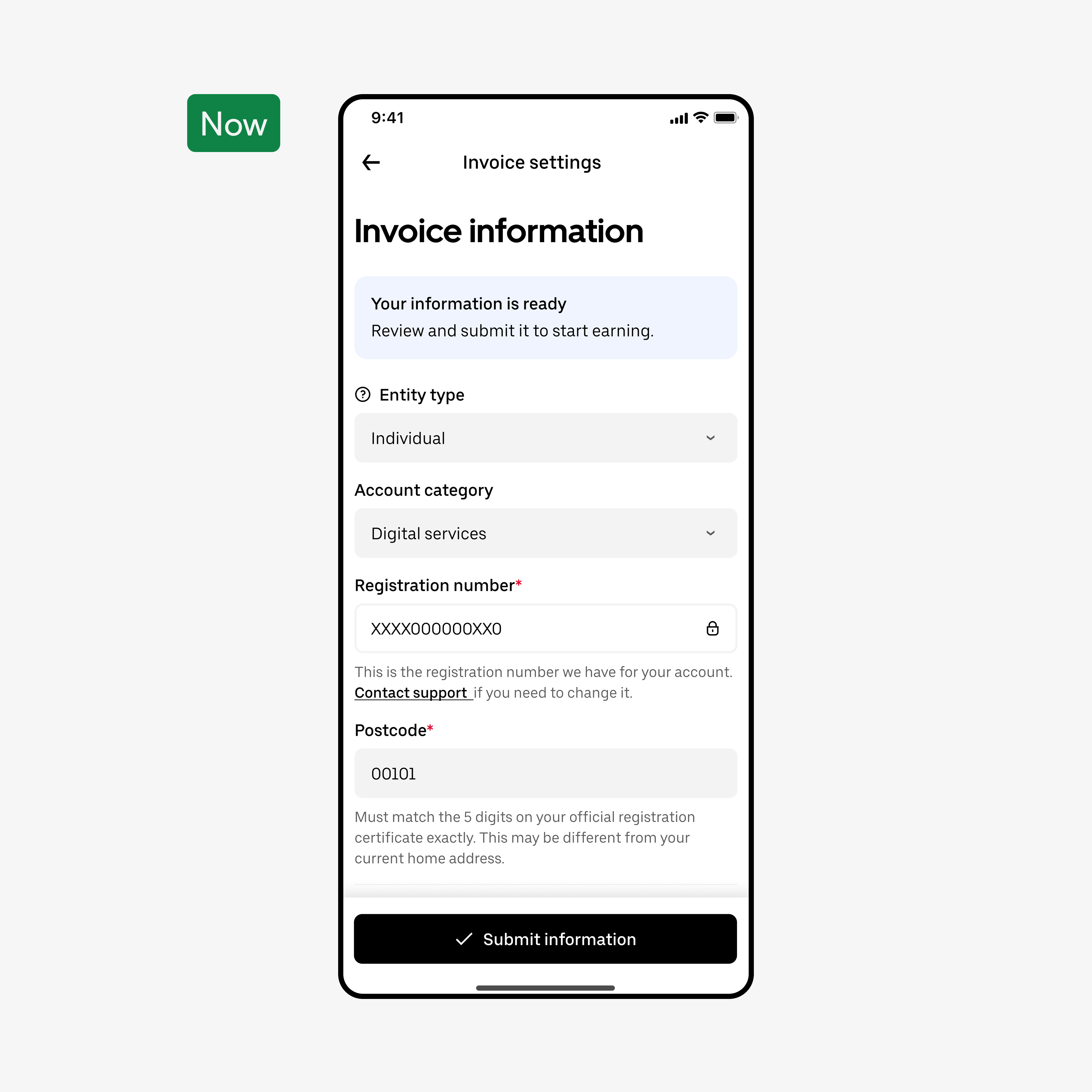
BeforeAfter
Complete form overhaul

Complete form overhaul

  • Regrouped fields into logical sections — individual and business paths no longer blurred together in one form

  • Secondary information moved behind dialogs, so the primary form only asked for what was needed right now

  • Conditional logic surfaced extra fields only when a user's own inputs required them, instead of showing every edge case up front

  • Added context and purpose upfront — earners knew exactly what they were completing and why before touching a single field

  • Entity preference selection at the start ensured the flow branched correctly, preventing mid-flow confusion

  • A clear CTA replaced an ambiguous entry point, directly reducing first-step drop-off

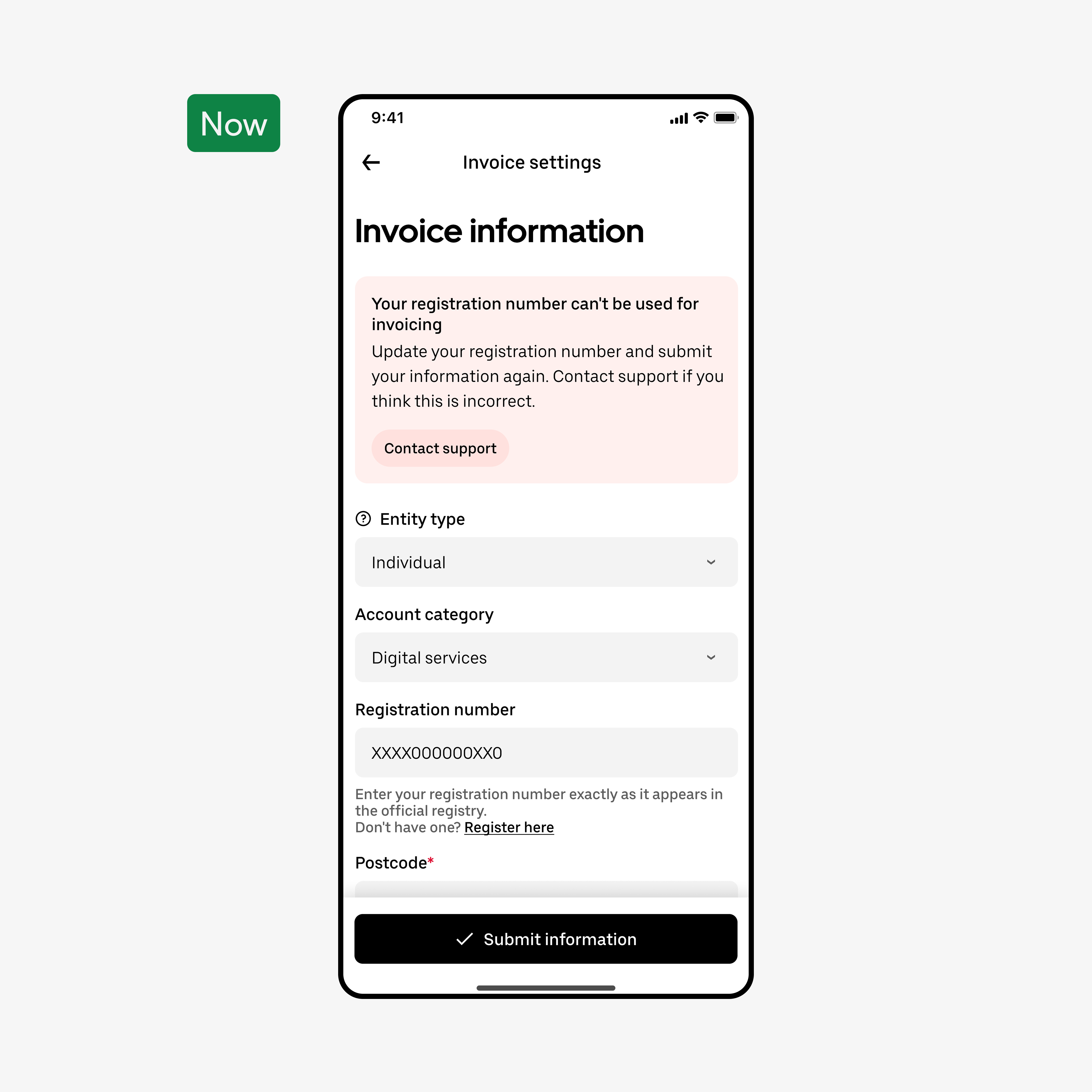
BeforeAfter
Action orientated error states

Action orientated error states

  • Rebuilt error banners around what to do next, not just what went wrong — pairing the cause with a clear recovery step

  • Errors surfaced inline, the moment a field was completed, instead of stacking up for a confusing review-screen surprise

  • Action-oriented language replaced generic validation text, turning a dead end into a fixable mistake

  • Brought certifications to the first navigation level — no more opening dialogs just to see what needed to be done

  • Dialogs reserved for additional context only, cutting unnecessary interaction steps

  • Shorter path, same compliance outcome — earners completed certifications faster with less friction