Uber

Redesigning Uber's Australia tax flow to turn a 24-hour identity bottleneck into a provisional fast path

Due to my NDA, I can't share actual imagery, data, or volumes from this project. What you see here is recreated for illustration — the strategy, design thinking, and decision-making logic stay true to the original work.

Due to my NDA, I can't share actual imagery, data, or volumes from this project. What you see here is recreated for illustration — the strategy, design thinking, and decision-making logic stay true to the original work.

Results

Results

100%

Task completion across usability testing, zero facilitator intervention

Results

0%

Abandonment across all six participants

Results

6.35/7

Average ease-of-use score

Team

Product Design

woman in black shirt smiling
a man with black hair and a beard smiling
man in black crew neck shirt wearing black framed eyeglasses

Product Management & Engineering

Tech stack

woman in black shirt smiling
a man with black hair and a beard smiling
man in black crew neck shirt wearing black framed eyeglasses

Design & AI

Role

Led end-to-end design, partnering closely with our UXR — who ran usability testing — and the PM throughout, under an active company-wide supply-growth escalation. Owned the provisional-activation mechanism and its fraud-safe validation logic, from concept through the current pre-launch stage.

Overview

A quick tax check was stuck behind a 24-hour delay

A quick tax check was stuck behind a 24-hour delay

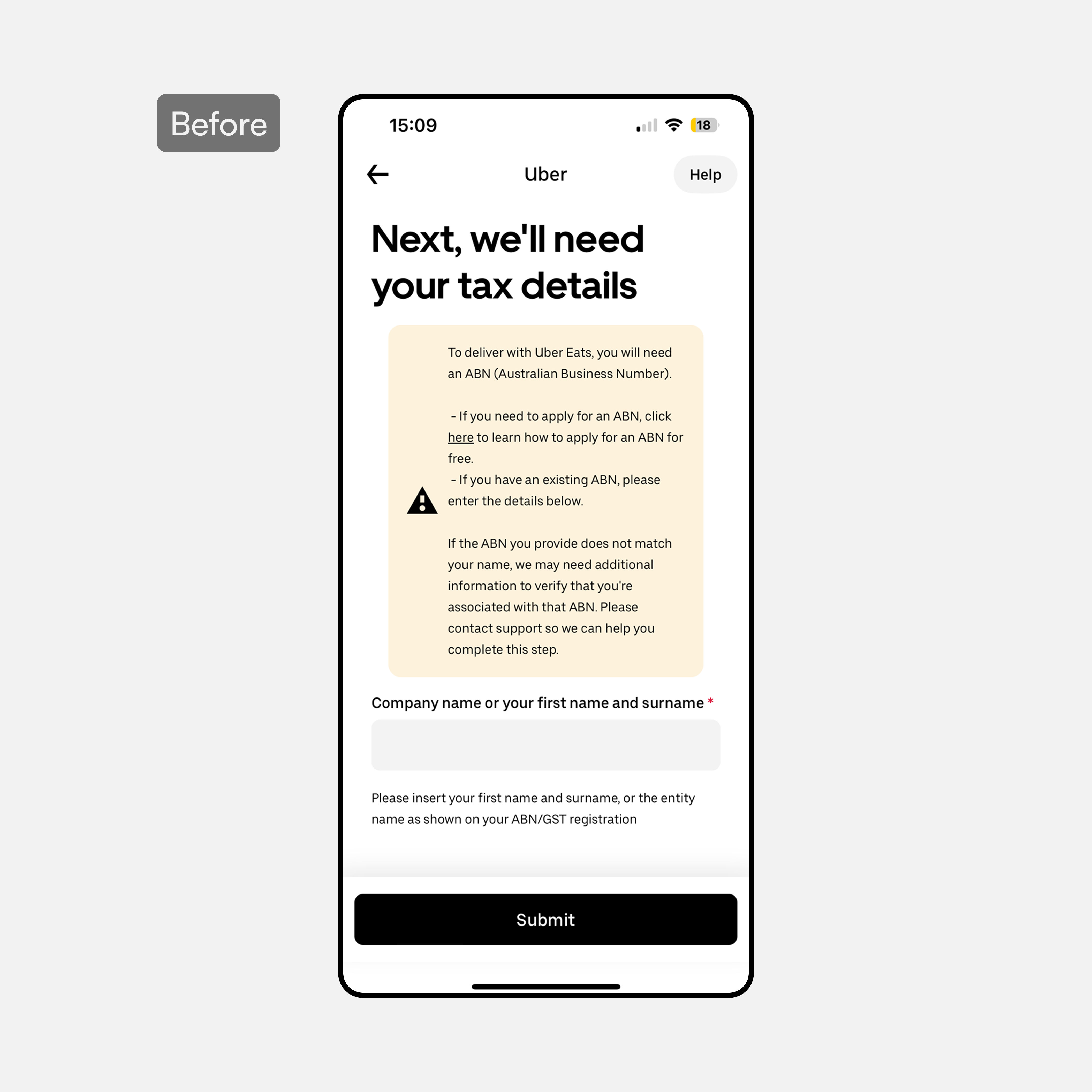
28% of Delivery signups raised a support ticket tied to their ABN, and 41% of those earners never activated. The cause was structural: a fast tax ID check sat gated behind a slower identity-matching process that could take up to 24 hours, with generic errors and no upfront disclosure of required documents. I redesigned the flow around provisional activation — validating the tax ID fast, letting earners start earning immediately, and letting the slower identity match complete in the background with an automatic block on any mismatch.

Insights

1 gate, 2 checks

ABN validation and identity name-matching were bundled into a single step — slow enough to create real friction exactly when intent was highest.

Drop-off after the hardest step

Drivers who'd already cleared a paid background check still fell out at the ABN stage — the point that should've felt safest was where people quit.

No way to recover from a mistake

No upfront disclosure of required documents, delayed validation, and no in-flow error recovery meant one wrong step sent people back to the start.

Locked fields read as broken

Disabled styling on read-only fields and an unscannable disclaimer made the form feel unreliable before drivers even reached the real question.

Testing & iterations

6 sessions resulted in 1 recurring failure - unclear language

6 sessions resulted in 1 recurring failure - unclear language

Participants understood every screen's purpose on sight — the checklist, the form, the review. What broke them was ambiguous status labels, tax jargon, and error states that named a problem without explaining it. From there, I focused on specific fixes that replaced ambiguity with clarity at each failure point.

Testing led me into asking myself this quesion

Testing led me into asking myself this quesion

How might we make every status, term, and error state as clear as the checklist that got earners here in the first place?

How might we make every status, term, and error state as clear as the checklist that got earners here in the first place?

Which led to these deliverables

Which led to these deliverables

Work

Experience where the users know where they stand

Experience where the users know where they stand

BeforeAfter
Single input = 1 background check

Single input = 1 background check

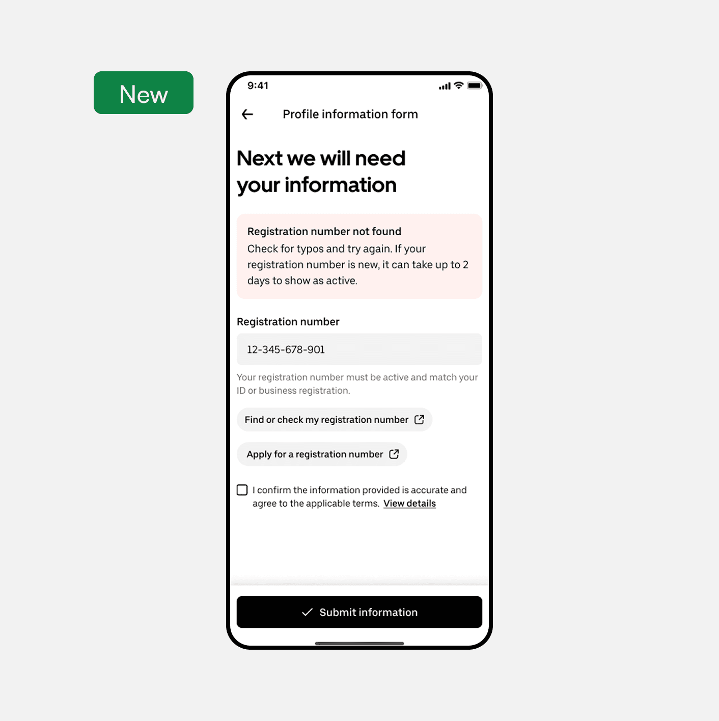
  • Registration number is now the only required field — the system runs the background check and extracts the rest of the data automatically

  • Inline external links let users verify their number's status without leaving the form

  • Inline banner messaging rewritten to tell users exactly what's needed from them, replacing the vague context testing flagged as confusing

  • Added context and purpose upfront — earners knew exactly what they were completing and why before touching a single field

  • Entity preference selection at the start ensured the flow branched correctly, preventing mid-flow confusion

  • A clear CTA replaced an ambiguous entry point, directly reducing first-step drop-off

  • Added context and purpose upfront — earners knew exactly what they were completing and why before touching a single field

  • Entity preference selection at the start ensured the flow branched correctly, preventing mid-flow confusion

  • A clear CTA replaced an ambiguous entry point, directly reducing first-step drop-off

Form that finally explains itself

Form that finally explains itself

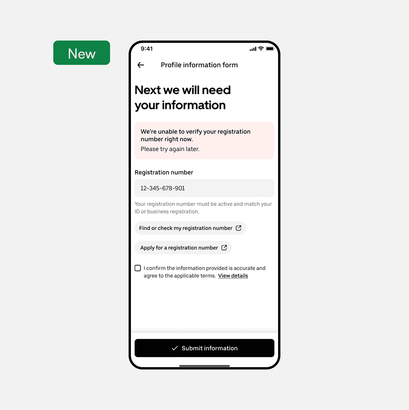
  • Submission now checks the registration number in real time — valid, active, or a generic system failure — instead of surfacing problems after the fact

  • Action-oriented error banners pair every failure with its cause and a clear way forward, replacing the flat "inactive" label testing showed users couldn't interpret

  • Errors resolve within the same flow the user is already in, instead of forcing a restart

  • Brought certifications to the first navigation level — no more opening dialogs just to see what needed to be done

  • Dialogs reserved for additional context only, cutting unnecessary interaction steps

  • Shorter path, same compliance outcome — earners completed certifications faster with less friction

  • Brought certifications to the first navigation level — no more opening dialogs just to see what needed to be done

  • Dialogs reserved for additional context only, cutting unnecessary interaction steps

  • Shorter path, same compliance outcome — earners completed certifications faster with less friction

BeforeAfter
Status-oriented onboarding

Status-oriented onboarding

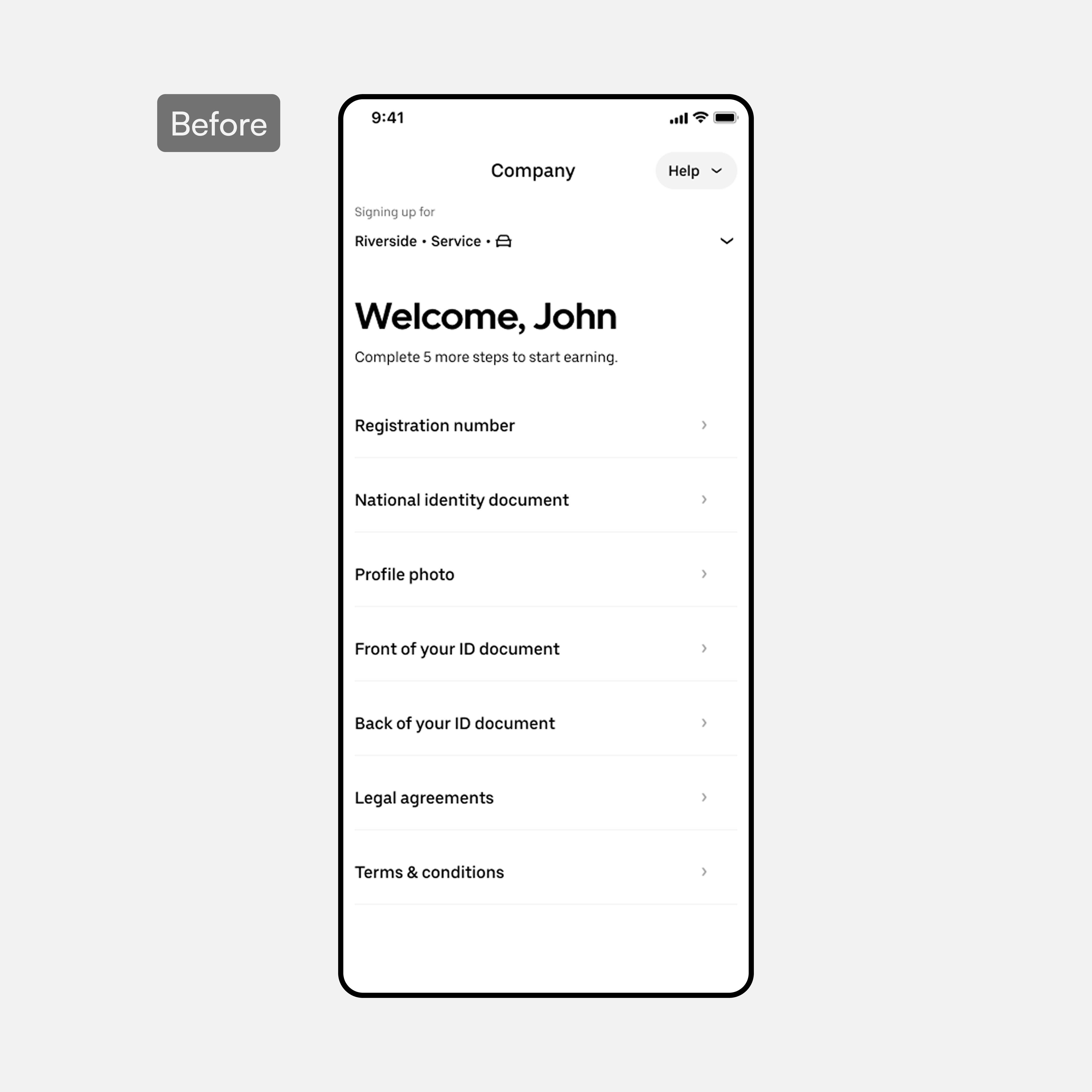
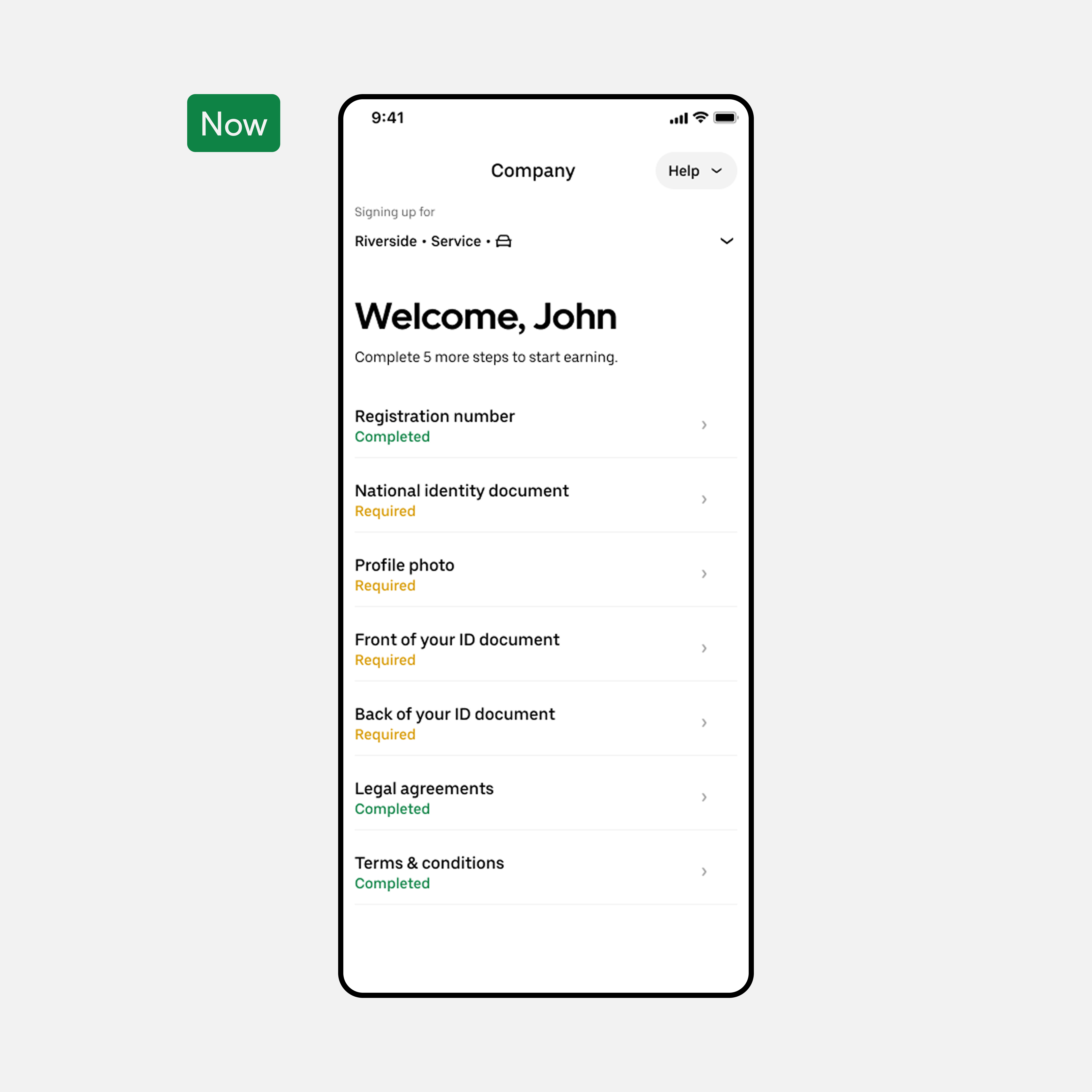
  • Every step is now clearly labeled with its current state, so users always know where they stand — no more items sitting with no status at all

  • Recommended and required actions are distinguished up front, telling users exactly where to start

  • Clear next-step guidance replaces ambiguity, so users act in time instead of stalling out blocked and unsure

  • Collapsed three disconnected steps into one linear scrollable form, eliminating disorientation between screens

  • Confirmation banners and success messages replaced silence — earners knew their input was accepted

  • Related fields grouped logically, reducing errors from unrelated data sitting side by side

  • Collapsed three disconnected steps into one linear scrollable form, eliminating disorientation between screens

  • Confirmation banners and success messages replaced silence — earners knew their input was accepted

  • Related fields grouped logically, reducing errors from unrelated data sitting side by side

New "view mode"

New "view mode"

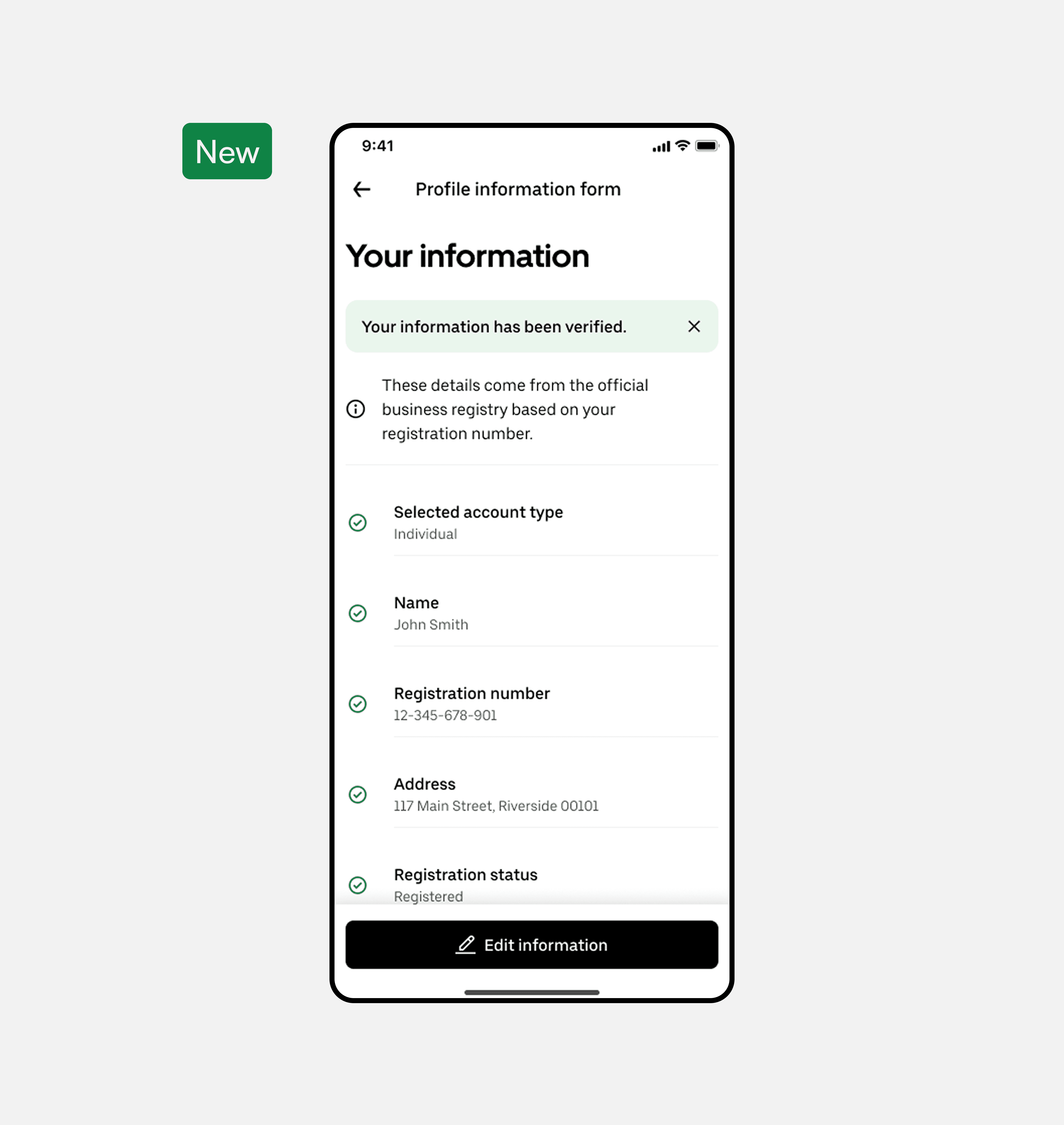
  • Single overview screen surfaces both what the user entered and the data extracted from the backend check, so nothing feels hidden or duplicated

  • Inline banners shift by state — verifying, error, or fully verified — so users always know exactly where their profile stands

  • A clear "verified and good to go" state replaces silence at the end of the flow, turning a blind submission into a confident final check

  • Brought certifications to the first navigation level — no more opening dialogs just to see what needed to be done

  • Dialogs reserved for additional context only, cutting unnecessary interaction steps

  • Shorter path, same compliance outcome — earners completed certifications faster with less friction

  • Brought certifications to the first navigation level — no more opening dialogs just to see what needed to be done

  • Dialogs reserved for additional context only, cutting unnecessary interaction steps

  • Shorter path, same compliance outcome — earners completed certifications faster with less friction