Uber
Building an internal UI kit 420 cross-functional teammates now build on
Building an internal UI kit 420 cross-functional teammates now build on

In line with my NDA, sensitive financial data, volumes and imagery have been anonymised. The strategy, design thinking and decision-making logic are accurate to the original project.
In line with my NDA, sensitive financial data, volumes and imagery have been anonymised. The strategy, design thinking and decision-making logic are accurate to the original project.
In line with my NDA, sensitive financial data, volumes and imagery have been anonymised. The strategy, design thinking and decision-making logic are accurate to the original project.
Impact
50%
Reduction in monthly closing review hours — giving the core team back half their time
2.8%
IC calculation errors eliminated, improving financial accuracy by 2.8% across all processed entries
Eight different tools, too many core issues, and label the same kind of data. Nobody asked me to find out why. I ran a full UX audit across Uber's Treasury domain — and the answer wasn't one broken screen. It was the absence of a shared one. So I built it.
Eight different tools, too many core issues, and label the same kind of data. Nobody asked me to find out why. I ran a full UX audit across Uber's Treasury domain — and the answer wasn't one broken screen. It was the absence of a shared one. So I built it.
Challenge
8 tools. 0 shared language.


I noticed the same friction resurfacing across every Treasury tool I touched — search fields too short to use, filters that looked like buttons, tables with missing column headers, CTAs with no clear hierarchy. Each tool had been built in isolation, by different teams, at different times, with no shared reference point back to Uber's own Base design system. The cost wasn't just visual inconsistency. It was slower engineering handoff, repeated design decisions from scratch, and a growing gap between what these tools looked like and what they were supposed to look like.
I noticed the same friction resurfacing across every Treasury tool I touched — search fields too short to use, filters that looked like buttons, tables with missing column headers, CTAs with no clear hierarchy. Each tool had been built in isolation, by different teams, at different times, with no shared reference point back to Uber's own Base design system. The cost wasn't just visual inconsistency. It was slower engineering handoff, repeated design decisions from scratch, and a growing gap between what these tools looked like and what they were supposed to look like.
Research
Auditing internal financial friction
Five analysts and accountants. One consistent message: the system forced them to work around it rather than with it. Here's what I found:
Five analysts and accountants. One consistent message: the system forced them to work around it rather than with it. Here's what I found:
The habit trap
Users worked around flaws due to familiarity, but constant horizontal scrolling and fixed layouts caused mental fatigue and reporting delays.
Dependency
Lacking native sorting or advanced filtering, analysts exported data to external sheets. This created a "data disconnect" and increased version-control risks.
Audit gaps
While change history existed, a lack of real-time visibility into "Settled" reversals made month-end reconciliations a time-consuming manual task.
Density vs. Clarity
Users required higher data density (up to 50 rows) but needed the flexibility to hide irrelevant columns to avoid information overload.
The habit trap
Users worked around flaws due to familiarity, but constant horizontal scrolling and fixed layouts caused mental fatigue and reporting delays.
Forced exports
Without native sorting or filtering, analysts pulled data into external sheets — creating version-control risks and a constant 'data disconnect' between the platform and the truth.
Audit gaps
While change history existed, a lack of real-time visibility into "Settled" reversals made month-end reconciliations a time-consuming manual task.
Density vs. Clarity
Users required higher data density (up to 50 rows) but needed the flexibility to hide irrelevant columns to avoid information overload.
The habit trap
Users worked around flaws due to familiarity, but constant horizontal scrolling and fixed layouts caused mental fatigue and reporting delays.
Audit gaps
While change history existed, a lack of real-time visibility into "Settled" reversals made month-end reconciliations a time-consuming manual task.
Forced exports
Without native sorting or filtering, analysts pulled data into external sheets — creating version-control risks and a constant 'data disconnect' between the platform and the truth.
Density vs. Clarity
Users required higher data density (up to 50 rows) but needed the flexibility to hide irrelevant columns to avoid information overload.
Four friction points. One clear conclusion: the reversal flow and the dashboard weren't separate problems — they were the same problem at different layers. The HMW question brought them together:
Four friction points. One clear conclusion: the reversal flow and the dashboard weren't separate problems — they were the same problem at different layers. The HMW question brought them together:
Four friction points. One clear conclusion: the reversal flow and the dashboard weren't separate problems — they were the same problem at different layers. The HMW question brought them together:
How might we provide transactional flexibility without compromising financial integrity?
How might we provide transactional flexibility without compromising financial integrity?
How might we provide transactional flexibility without compromising financial integrity?
Framed a clear way forward
Framed a clear way forward
With the four friction points mapped and the HMW question defined, I moved into concept and usability testing — focusing on how to give power users control without adding complexity.
With the four friction points mapped and the HMW question defined, I moved into concept and usability testing — focusing on how to give power users control without adding complexity.
With the four friction points mapped and the HMW question defined, I moved into concept and usability testing — focusing on how to give power users control without adding complexity.
Concepts & testing
Testing = utility over aesthetics
Testing = utility over aesthetics
Five 1 on 1 usability sessions stress-tested the high-density dashboard. The conclusion was unambiguous: In enterprise financial tools, data accessibility beats aesthetic polish every time.
Five 1 on 1 usability sessions stress-tested the high-density dashboard. The conclusion was unambiguous: In enterprise financial tools, data accessibility beats aesthetic polish every time.
60% of users
struggled with long dropdowns. This led to the integration of multi-select and inline search functionality for faster data narrowing.
80% of users
rejected accordions in favor of a flattened hierarchy. The design was reverted to a direct-data view to eliminate unnecessary clicks.
100% of users
requested moving "Status" to the first column, identifying it as the primary mental anchor for their workflow.
100% of users
requested increasing viewable results beyond 50 rows. The final UI was adjusted to support higher row counts, reducing pagination fatigue.
60% of users
struggled with long dropdowns. Added multi-select and inline search, cutting dropdown interaction time significantly.
80% of users
rejected accordions in favor of a flattened hierarchy. Reverted to a flat direct-data view — one fewer click for every single interaction.
100% of users
requested status to be moved to column one.
Non-negotiable.
100% of users
requested increasing viewable results beyond 50 rows. Increased row density beyond 50, eliminating the pagination interruption that broke focus.
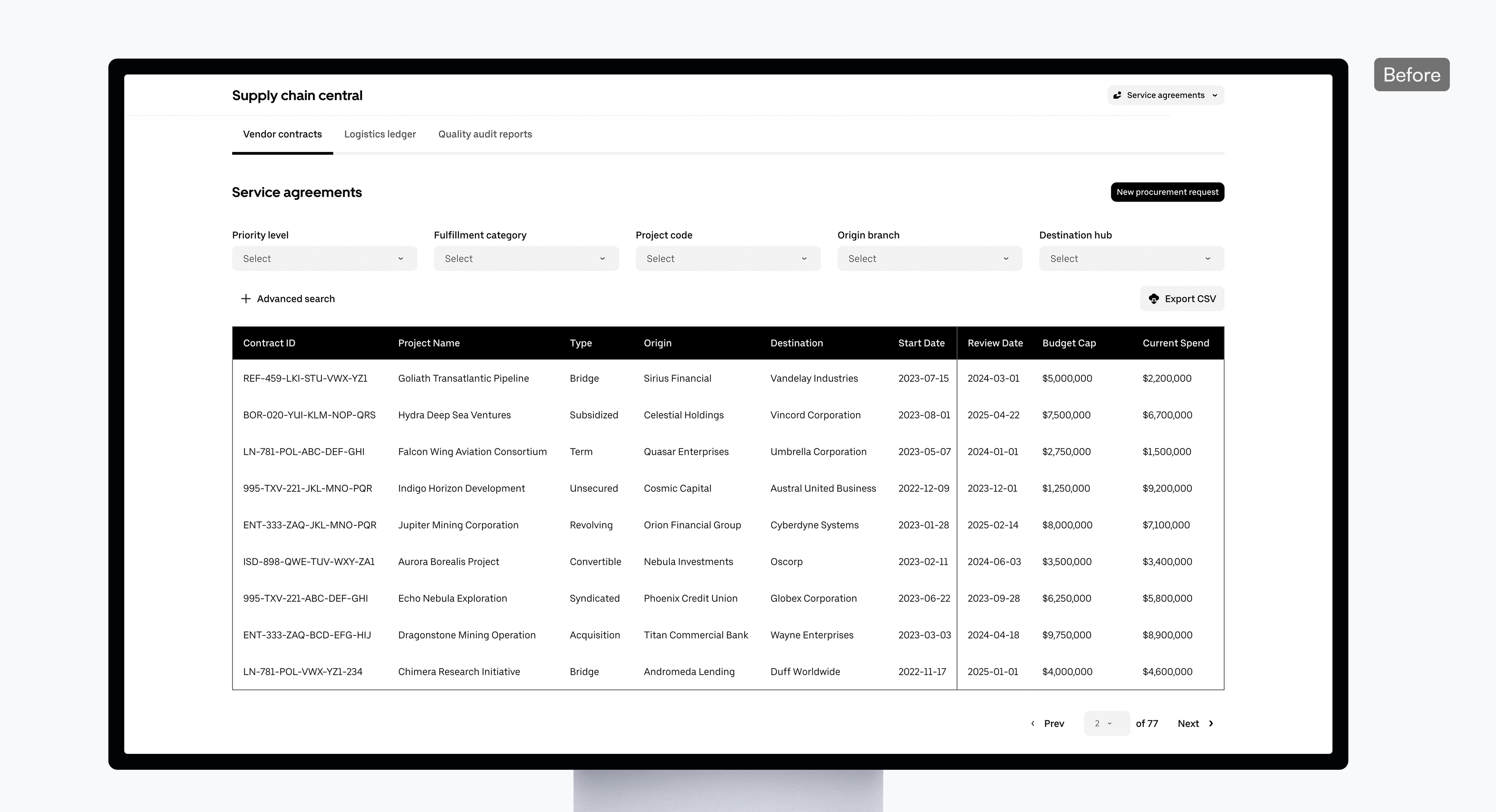
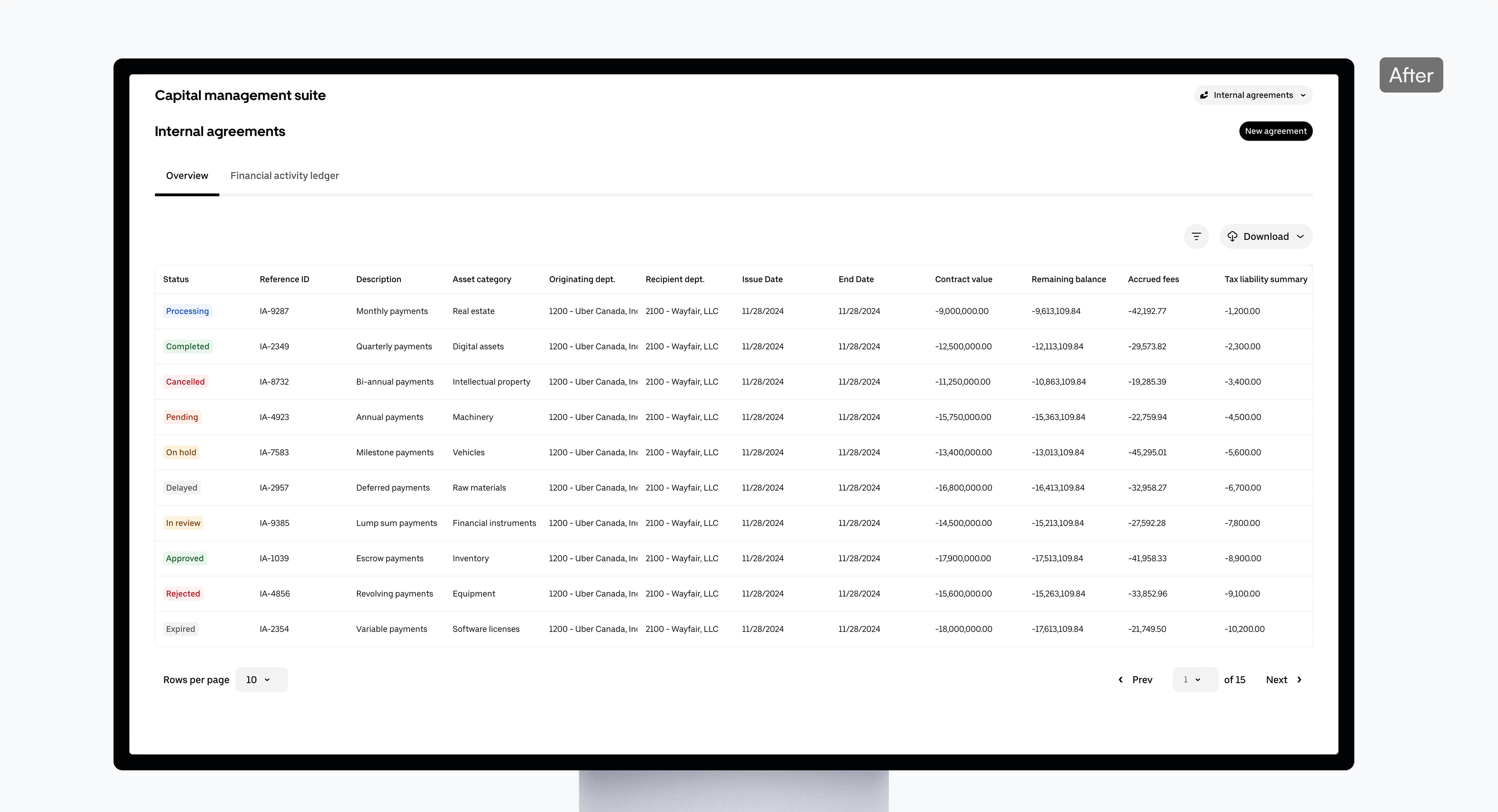
Agreements dashboard

Smart column hierarchy
Reordered the layout to put critical status info front and center, successfully eliminating the need for horizontal scrolling.

Streamlined filtering
Introduced a collapsible menu with multi-select and search features, keeping the screen clean without sacrificing deep-dive power.
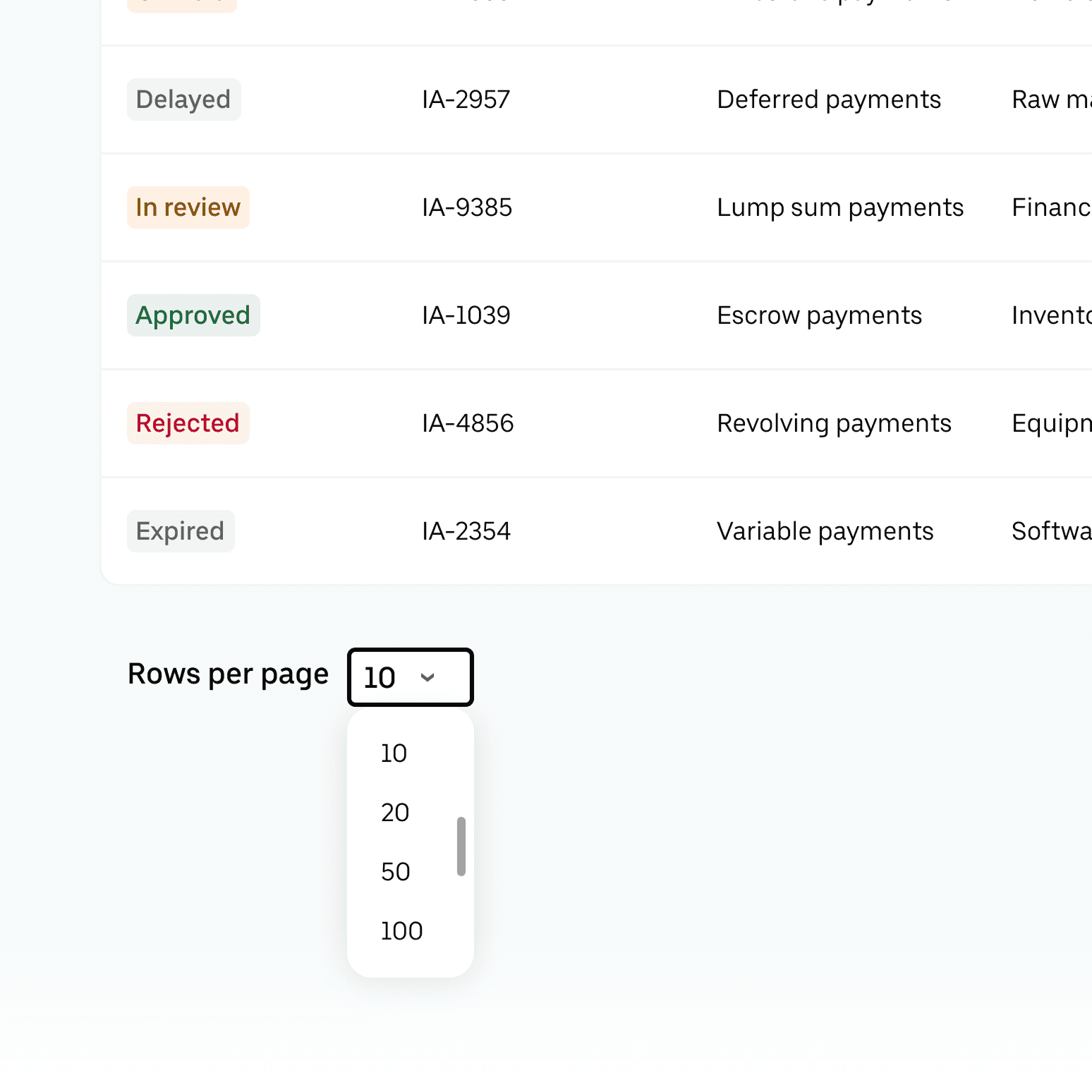
Data density control
Added flexible pagination so users can view up to 50+ rows at once, significantly reducing time spent clicking through pages.

Clean information architecture
Consolidated the navigation from 3 tabs down to the 2 essential, removing the "noise" that slowed down daily tasks.
Smart column hierarchy
Reordered the layout to put critical status info front and centre — eliminating horizontal scrolling entirely.
Streamlined filtering
Introduced a collapsible menu with multi-select and search features, keeping the screen clean without sacrificing deep-dive power.
Data density control
Added flexible pagination supporting 50+ rows — cutting the time analysts spent clicking through pages.
Clean information architecture
Consolidated navigation from 3 tabs to 2 — removing the noise that slowed every daily task.
Retrospective
Retrospective
This is still rolling out, but the reach is already real: the kit and its components are built to serve up to 420 people across accounting, treasury, engineering, and product — and every future tool in this domain now starts from a shared foundation instead of another one-off decision.
This is still rolling out, but the reach is already real: the kit and its components are built to serve up to 420 people across accounting, treasury, engineering, and product — and every future tool in this domain now starts from a shared foundation instead of another one-off decision.
The redesign scaled to 5M US earners and supported the generation of over 2M tax forms — directly reducing IRS penalty exposure for the business and eliminating backup withholding risk for earners. Coverage moved from 19% toward a compliant threshold across the earner base.
"Evgeniy brought an exceptional balance of speed and craft to the project. He consistently delivered high-quality design work on time, helping the team move faster without compromising standards."
B.Singh
Senior PM @ Uber
"Evgeniy brought an exceptional balance of speed and craft to the project. He consistently delivered high-quality design work on time, helping the team move faster without compromising standards."
B.Singh
Senior PM @ Uber